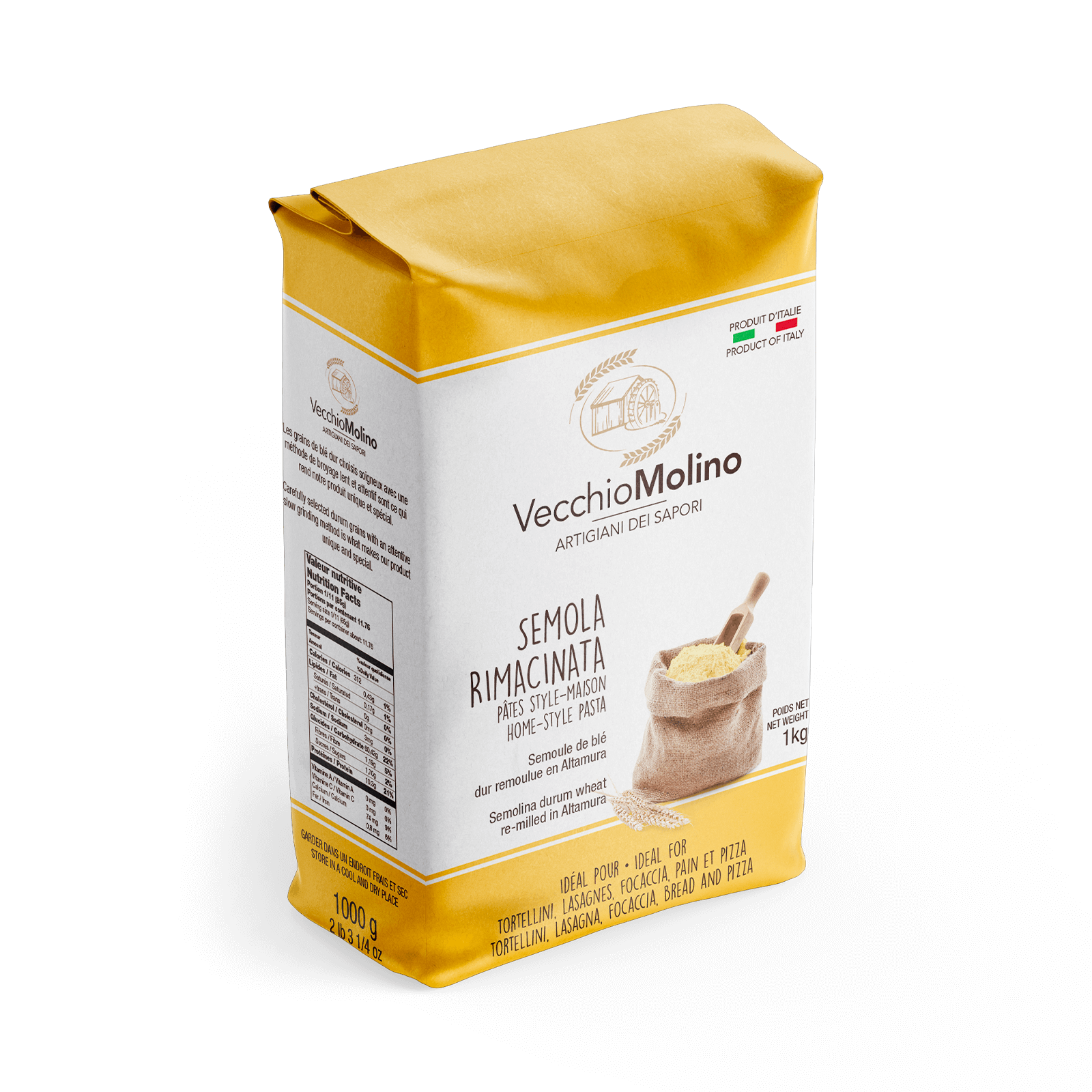
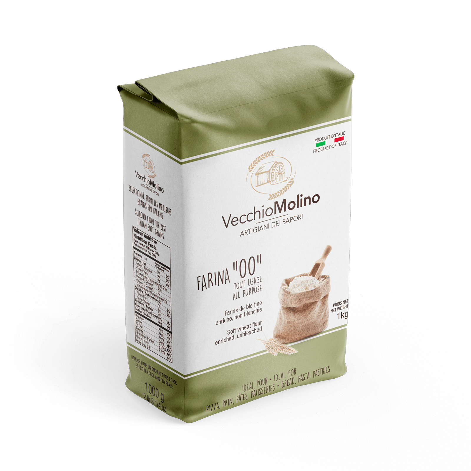
Vecchio Molino
The new packaging for Vecchio Molino flour has been designed with simple, legible fonts that combine modernity and tradition to make the information clear and appealing. The packaging stands out for its simplicity, clarity and versatility.
The packaging design uses soft colours and a clear layout. The graphics allow consumers to instantly identify the product and its main characteristics. Essential information such as the type of flour, its origins and how to use it are presented clearly for effective and immediate communication.
The packaging has been designed to easily adapt to the company’s different product lines, maintaining a visual consistency that makes each variant instantly recognisable as part of the same family.