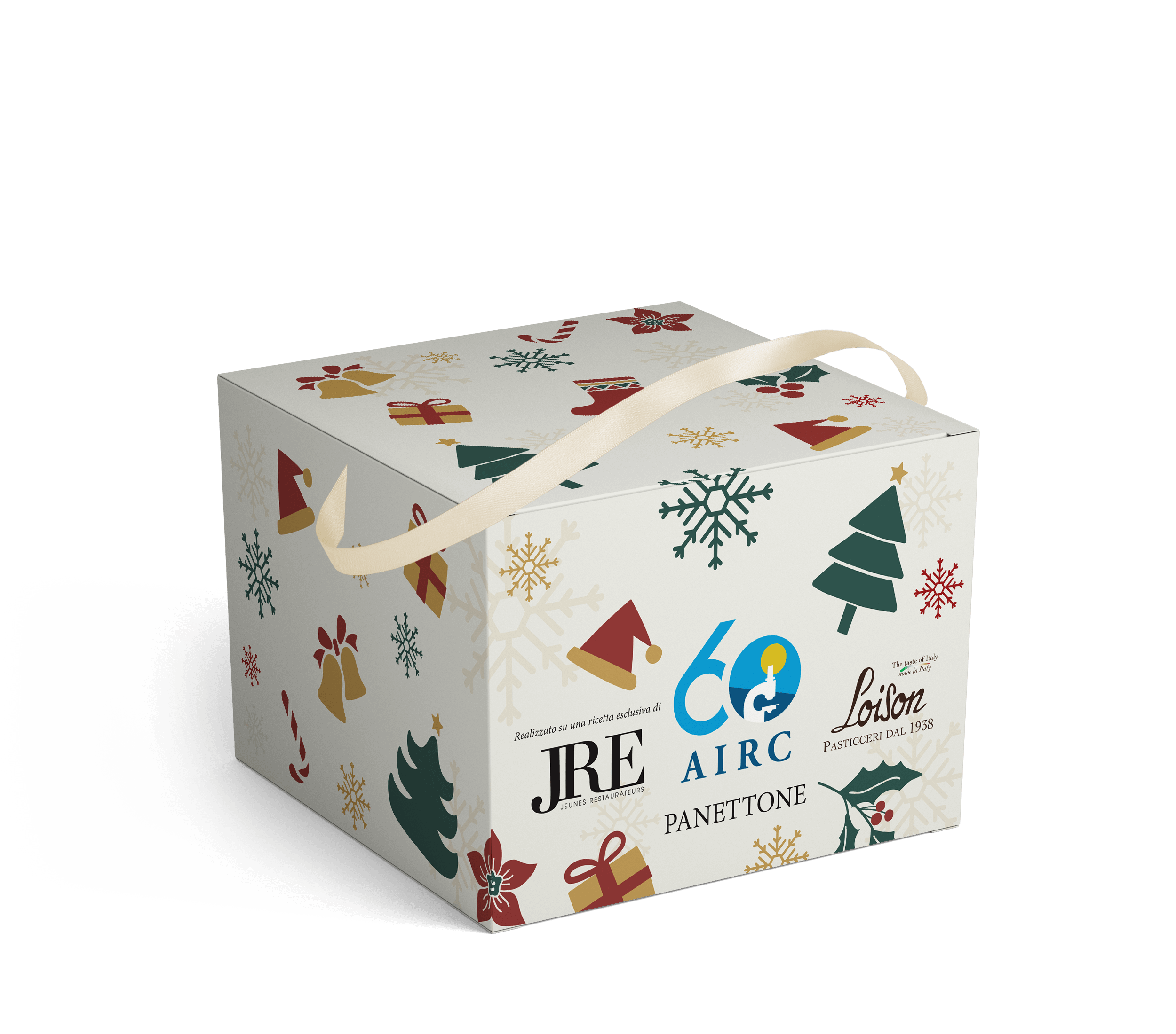
Airc
For the 60th anniversary of AIRC (Italian Association for Cancer Research), Sonia Design created a custom-made box for Loison panettone with a recipe by JRE (Jeunes Restaurateurs d’Europe). The graphics were designed based on the AIRC shop’s Christmas catalogue, in line with the brand’s guidelines and directives, to ensure visual consistency and harmony with the association’s identity.
The AIRC, JRE and Loison logos were placed prominently on the front, emphasising the collaboration and enhancing both organisations. The fabric handle, coordinated with the colours and style of the box, completes the packaging with elegance and functionality.
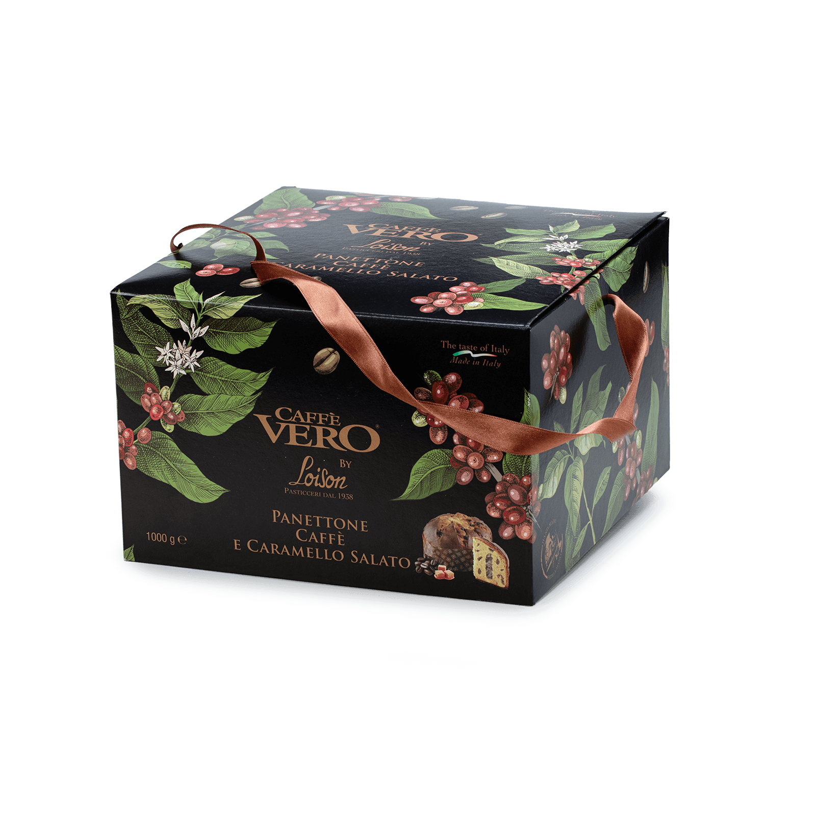
Caffè Vero
The “Box” is a customised packaging solution, tailor-made to perfectly fit the product it will contain. It is a sturdy and versatile cardboard box, designed to combine functionality and aesthetics.
The external graphics are fully customisable, leaving plenty of room for creativity: each box is designed based on the customer’s specifications to ensure a unique result that is perfectly in line with the brand identity. In the case of Caffè Vero, particular attention was paid to the consistency between the image and the ribbon, designed to create a harmonious and immediately recognisable whole.
The design is completed by a fabric handle, coordinated with the style of the box and the brand identity, and the possibility of integrating co-branding, ideal for collaborations or promotional initiatives.
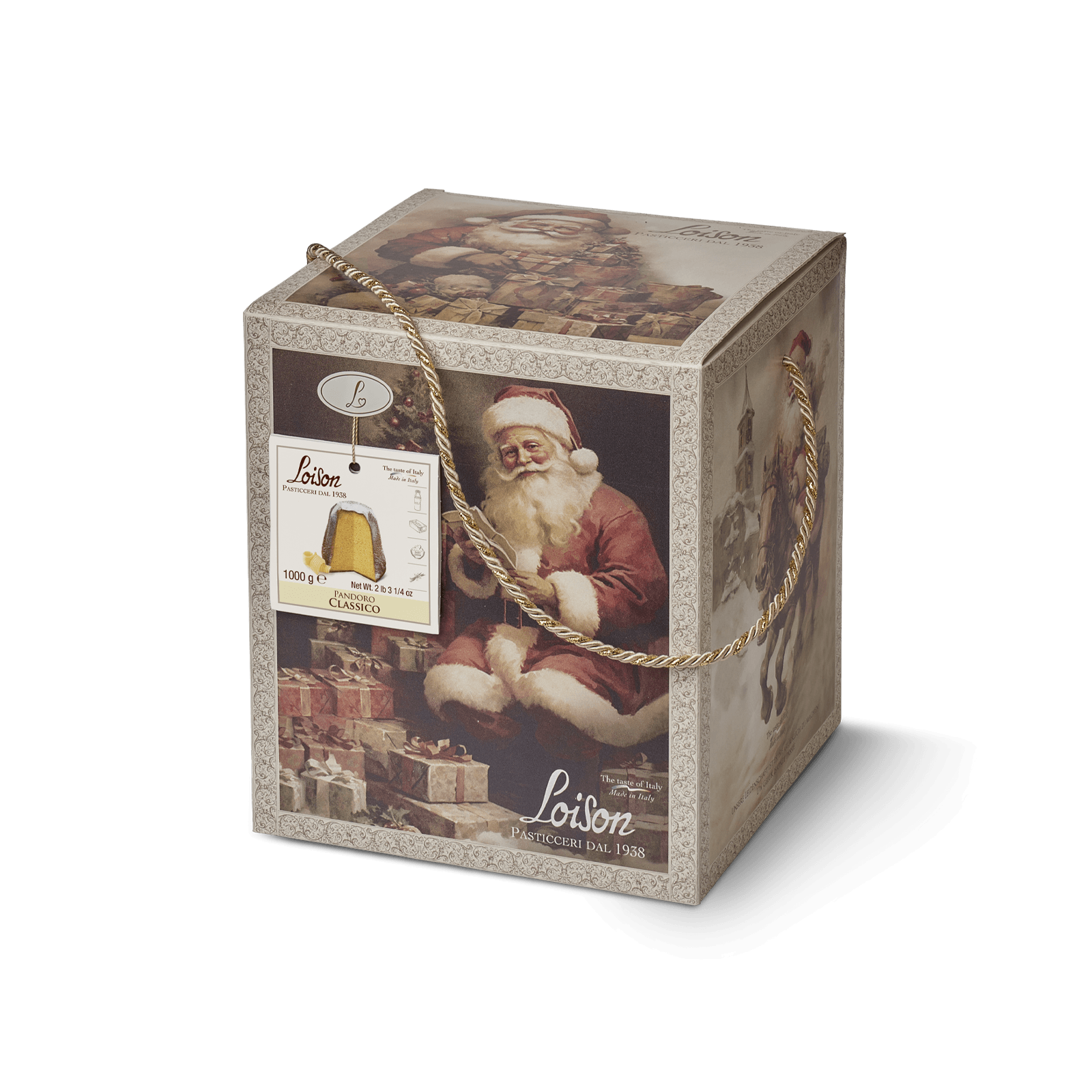
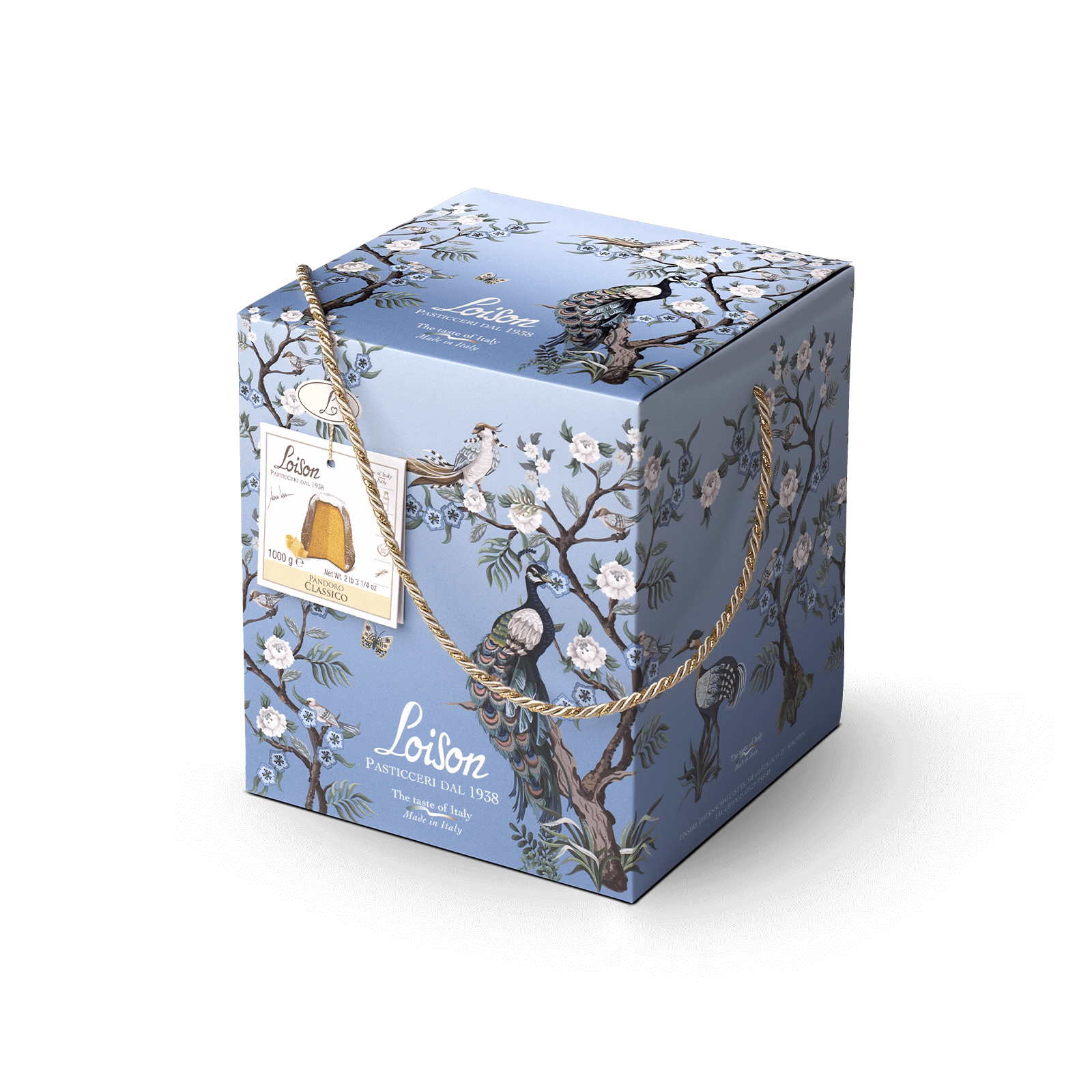
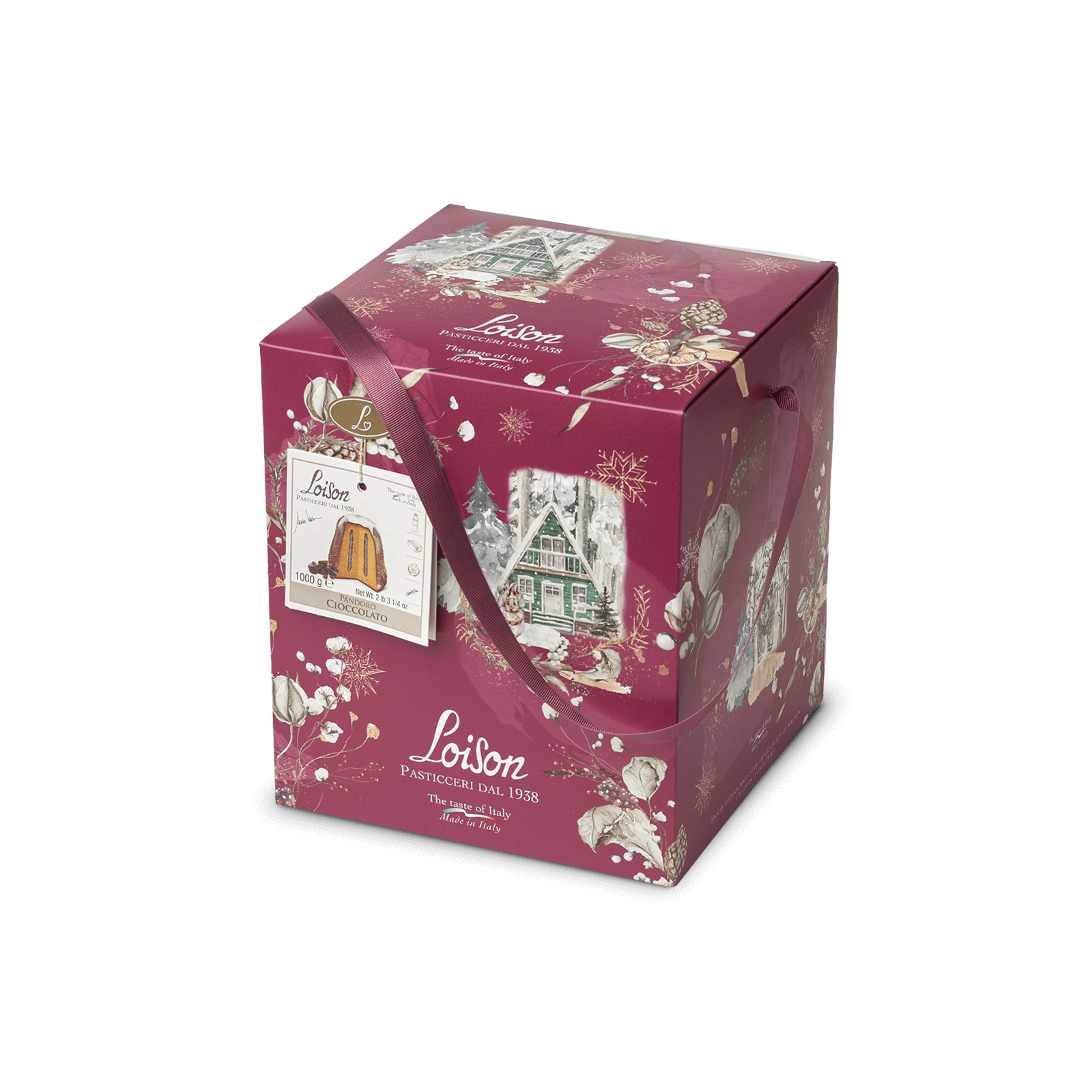
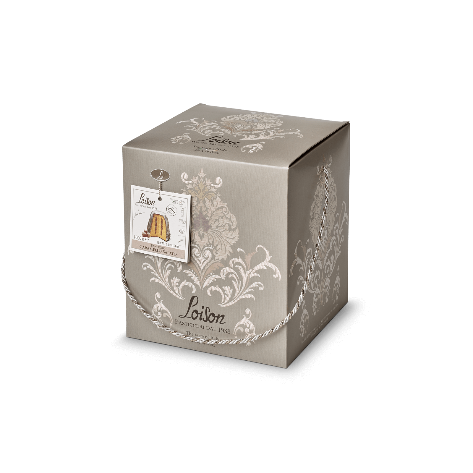
Loison Pasticceri dal 1938
The packaging project was developed to enhance a product with a tall, vertical form such as the pandoro, through a structure designed to emphasize its height and clearly identify the product.
The packaging system stands out for its graphic versatility, which over time has allowed multiple visual interpretations, adapting to different languages, from traditional Christmas storytelling to more emotional and evocative solutions.
The large surface of the box thus becomes an open narrative space, designed to host rich graphics and detailed compositions, capable of enhancing each new edition of the product without losing structural coherence.
As a complement to the system, the handle can be developed in cord with lamé insert, double satin, or gros-grain, available in coordinated color variants. This element, both functional and decorative, contributes to enriching the overall perception of the packaging, emphasizing its details and strengthening its distinctive character.
For this product category, a dedicated tag is also designed, serving as an ingredient cartouche, integrated into the visual system of the packaging and contributing to both the informational and aesthetic dimension of the overall design.
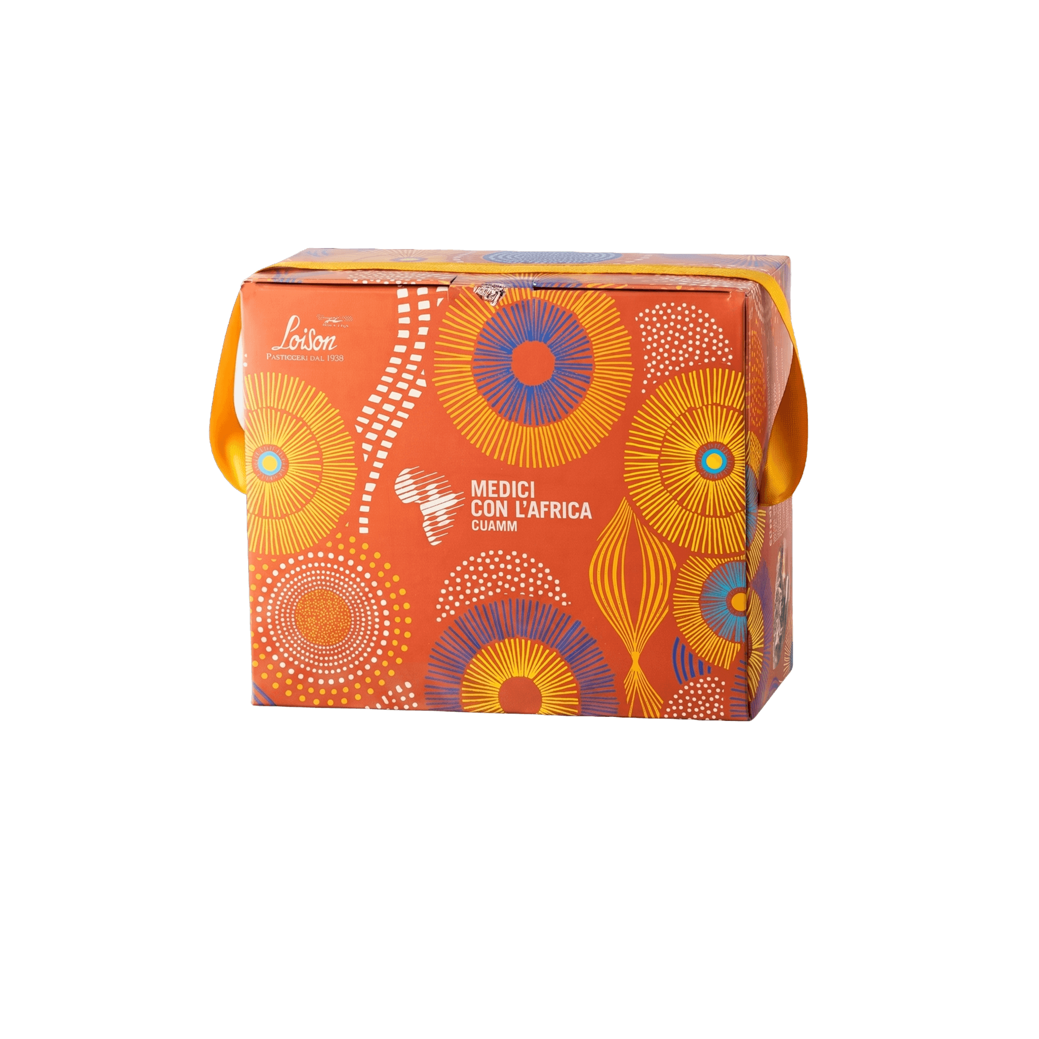
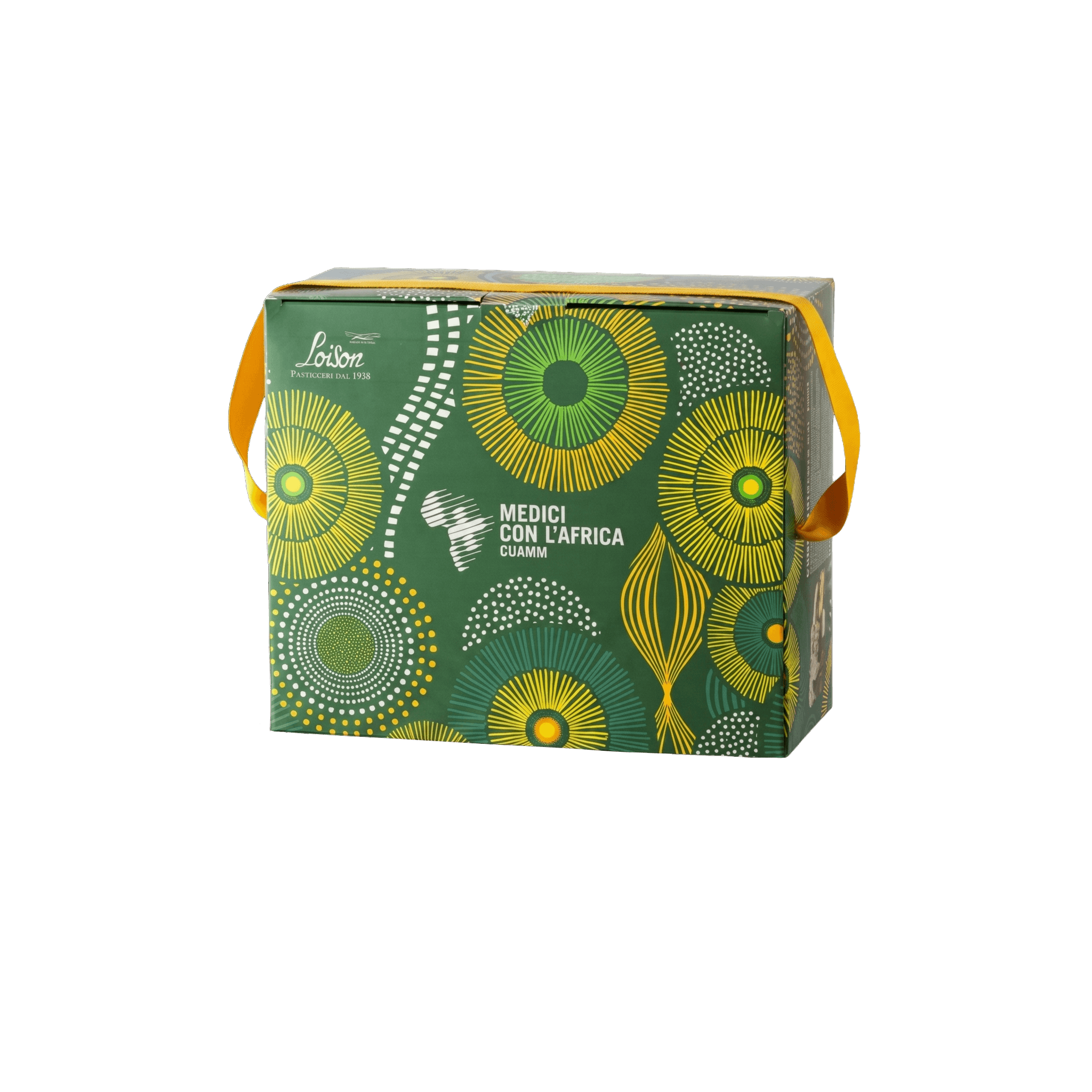
Cuamm
Telling a story of cooperation and closeness through packaging was the guiding challenge behind the project developed by Sonia Design for Cuamm. The packaging was conceived with the aim of translating the organization’s values into a visual language, creating a meaningful connection with African territories.
The core of the project is an original texture inspired by the patterns and craftsmanship of traditional African textiles. Through the graphic interpretation of these decorative motifs, the packaging gains character and authenticity.
The color palette was designed to communicate warmth and energy, while the graphic composition brings balance and elegance to the overall design. Every element contributes to building a distinctive identity.
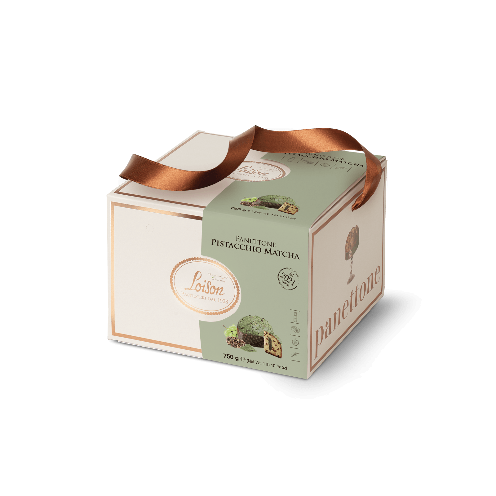
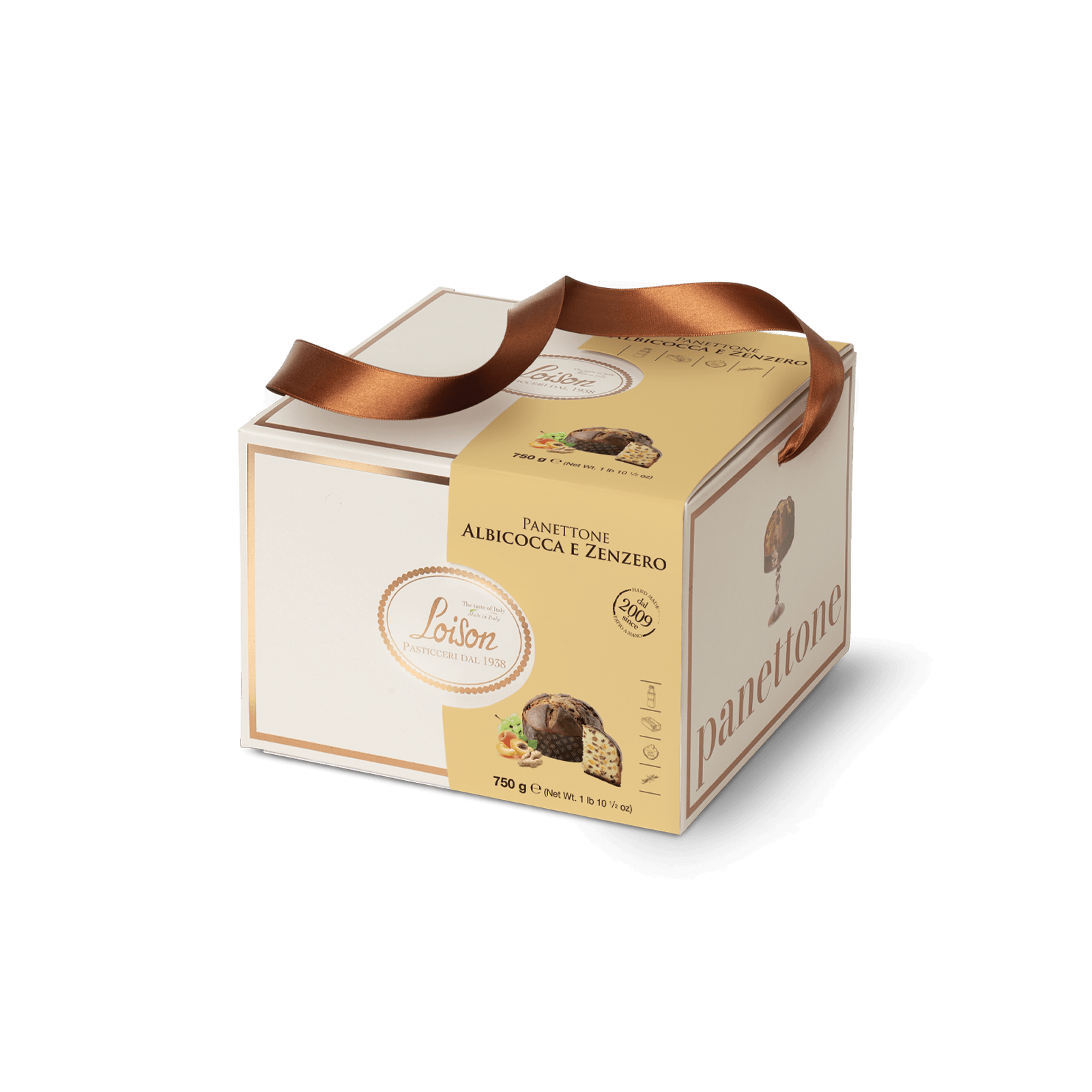
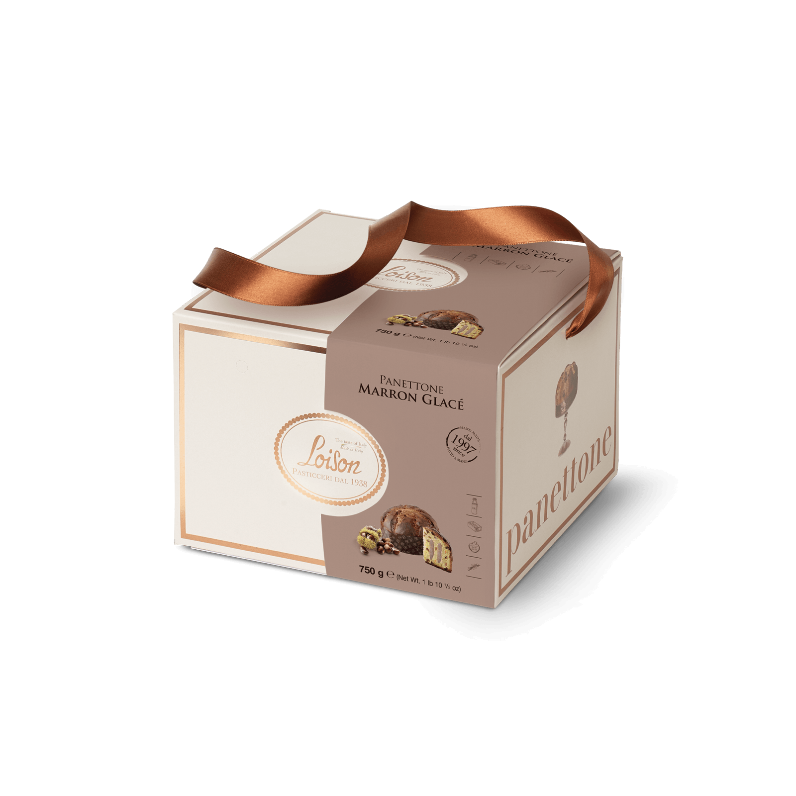
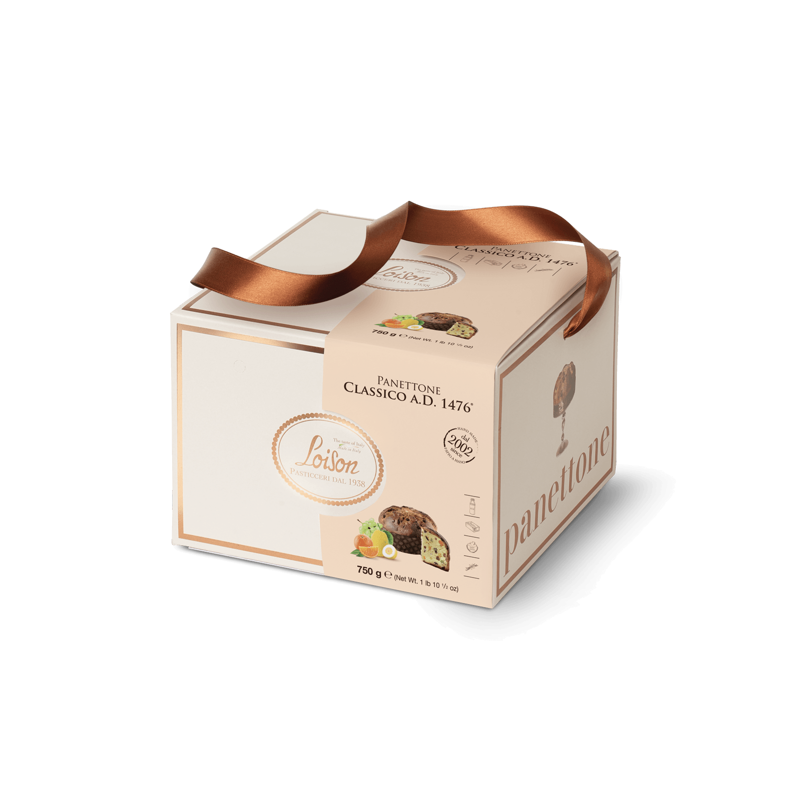
Loison Pasticceri dal 1938
The reinterpretation of the Gold Collection for Loison stems from the need to update the existing system while preserving its distinctive codes, through a design approach that balances continuity and evolution.
The entire packaging system has been reinterpreted with a stronger focus on visual hierarchy, with the aim of reinforcing the premium positioning of the product. Graphic elements have been refined and reduced to highlight the centrality of the product and its presentation.
The oval emblem remains a stable and recognizable identity marker, while the side surfaces continue to convey the product narrative through evocative imagery of the panettone displayed on a cake stand, emphasizing its artisanal and celebratory nature. The color band dedicated to the different flavors maintains its role as an identification code, integrating more subtly into the overall system while also improving shelf readability and stackability.
Completing the visual system, the double satin ribbon, coordinated with the pack’s graphic frame, introduces an additional layer of material refinement, enhancing the perception of care and quality and contributing to the overall compositional balance.
The color palette was designed to communicate warmth and energy, while the graphic composition brings balance and elegance to the overall design. Every element contributes to building a distinctive identity.