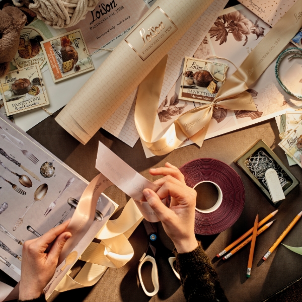
Sonia Design is a specialiser in customised packaging. The proposal is in the creation of unique packaging that captures customers’ attention and promotes the brand in a distinctive way. Sonia Design customisations are designed to reflect the identity of companies, using distinctive colours, graphics and elements in line with their image and history.
Customized Packaging
Setup "PACKAGE"
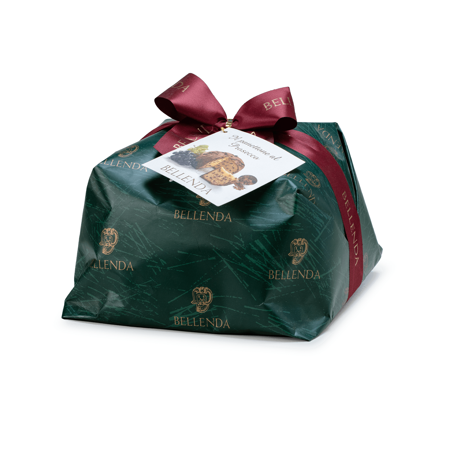
Bellenda
This packaging solution involves wrapping a client’s product with custom paper and ribbon. The paper design can focus on the company’s brand or logo, or reflect its style and/or images from its tradition to make it easily recognizable to the end consumer. The careful and distinctive choice of ribbon completes the packaging, considering its craftsmanship, color, which should delicately match the paper, and the packaging itself.
If the total packaging cost is too high for the client, an alternative is a Co-Branding approach. In this case, the customized ribbon with the client’s logo can be used, while the wrapping can feature the packaging of the product manufacturer (e.g., for a panettone), which would include the images or logo of the producer (see packaging for company D. Barbero).
Setup "GIFT PACKAGE"
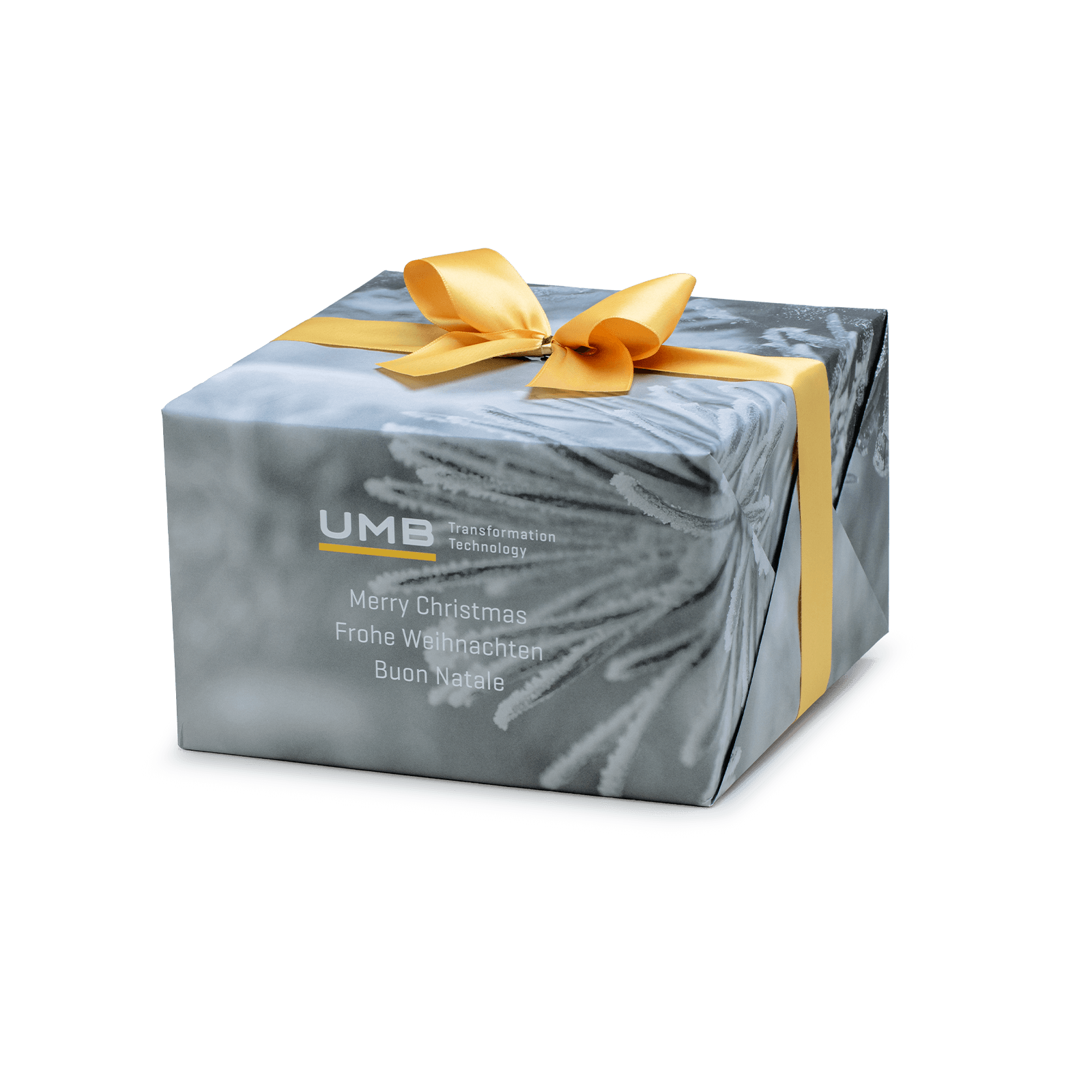
UMB
The request was to package a dessert by designing its shape. The solution implemented was an internal structure made of corrugated cardboard with a top opening, with the company’s logo printed on it to ensure the marketing message was clearly highlighted. It was then wrapped with paper that features a print conveying a striking yet elegant Christmas greeting. The presence of the client’s brand and the choice of ribbon color resulted in a refined and elegant packaging.
Setup "GIFT PACKAGE"
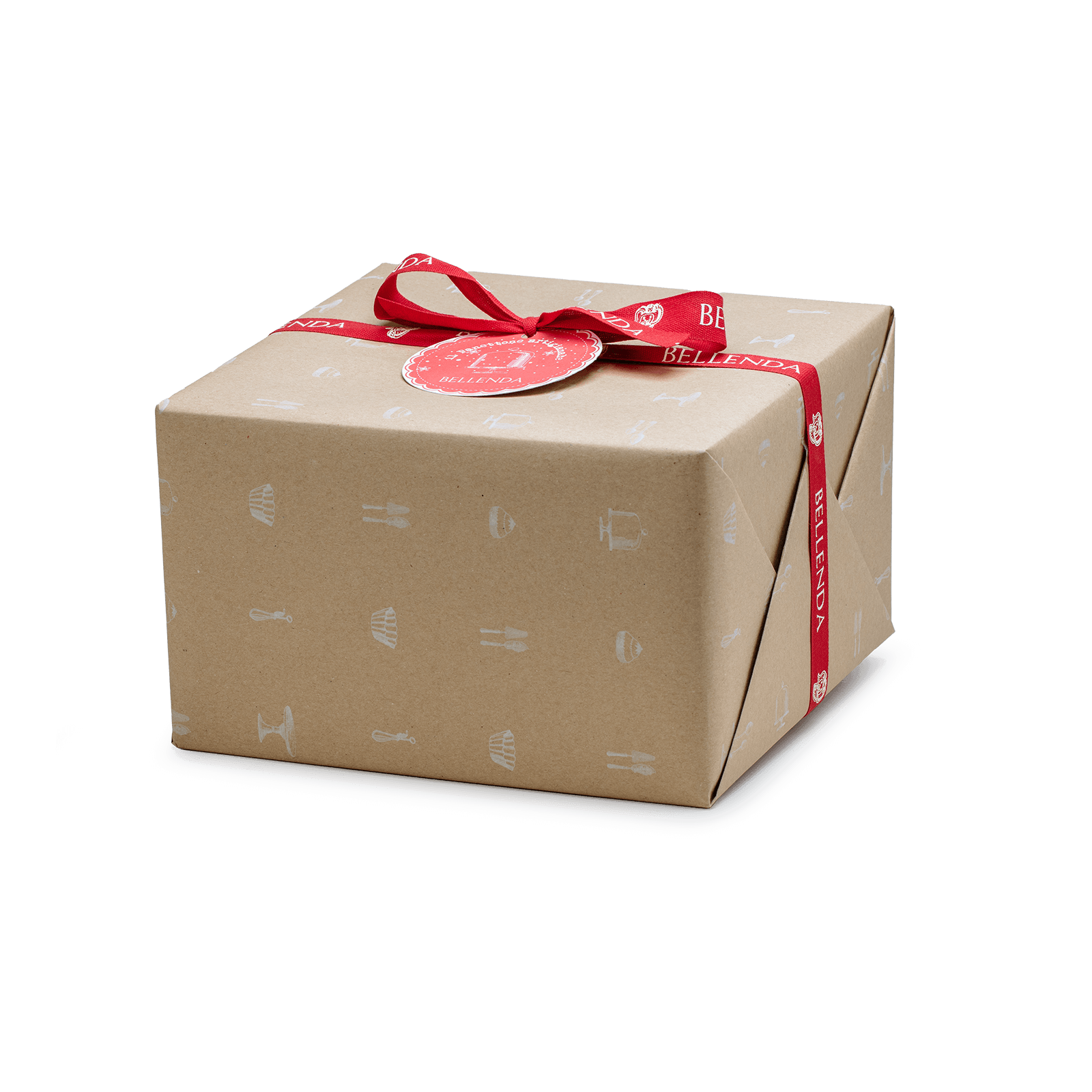
This is another packaging solution similar to the previous one, featuring a corrugated cardboard box to protect the product. The external wrapping that envelops the structure aims to offer a solution with more natural and eco-sustainable tones. The ribbon’s craftsmanship was decided after careful research to ensure it aligns with the paper.
Setup "GIFT PACKAGE"
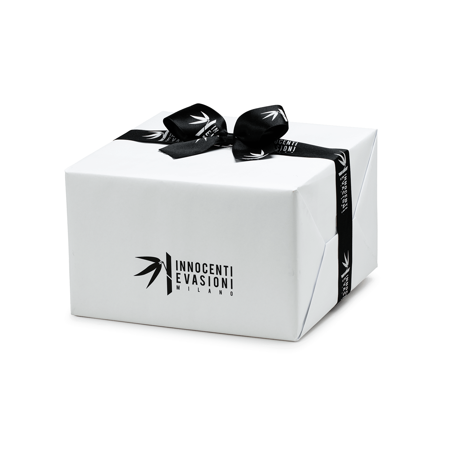
Innocenti Evasioni
This packaging solution was designed with an internal structure to protect the product, while the wrapping paper’s role is to minimally and precisely convey the client’s brand. The choice of a branded ribbon, matched with the brand’s color, completes this balanced and elegant proposal.
Setup "GIFT PACKAGE"
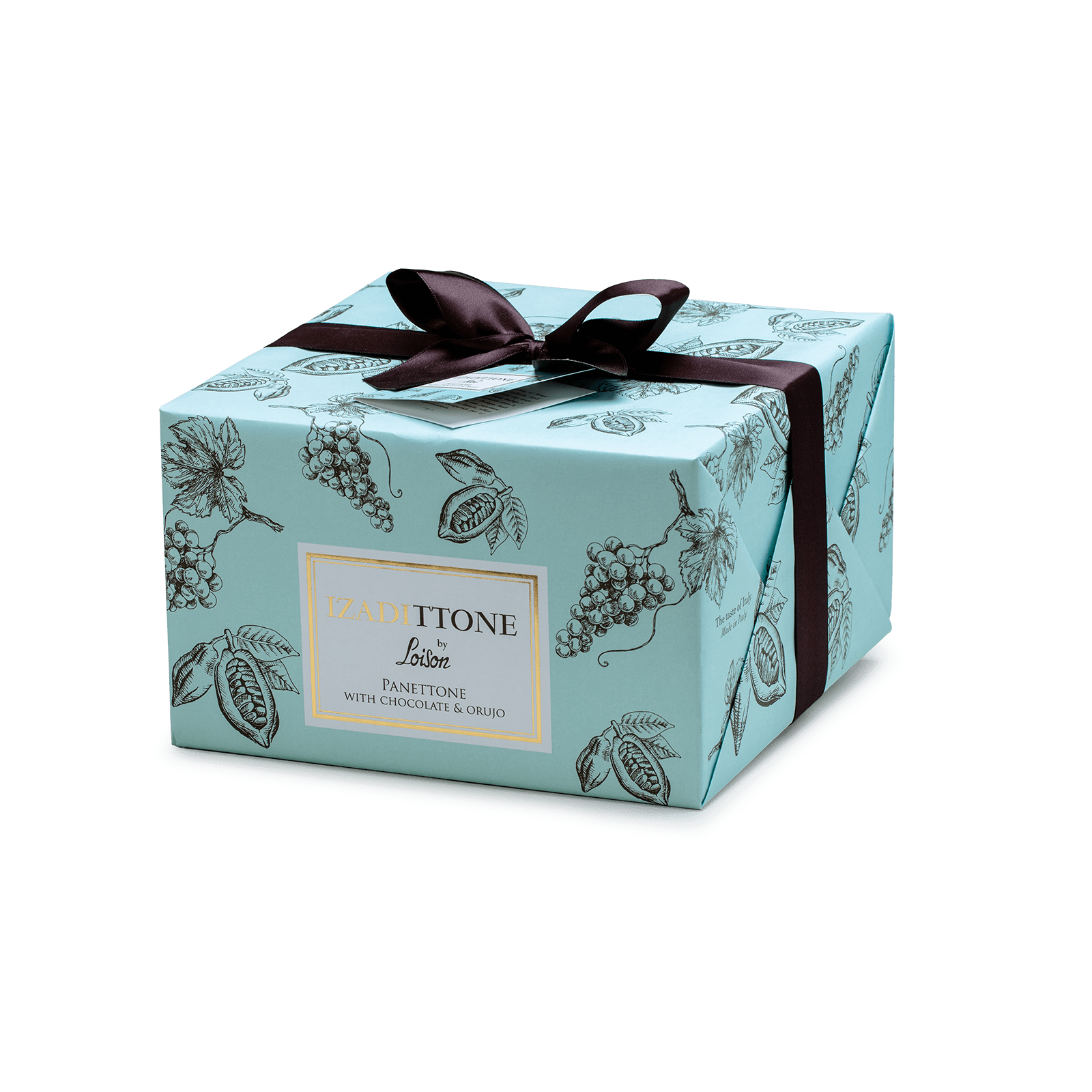
Izadi
The proposal was created with a corrugated cardboard structure to protect the product inside. The paper wrapping the structure features a cheerful, sunny print that clarifies the ingredients contained in the product. The choice of ribbon aligns with this solution, and the label emphasizes the co-branding.
Setup "TIN"
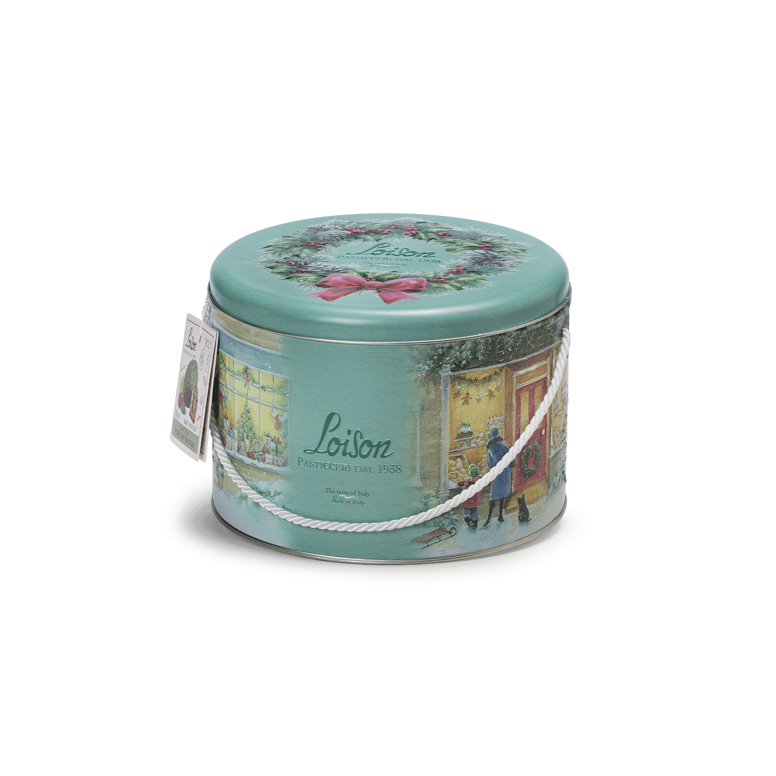
Loison
The design of this tin was conceived for a panettone. The images with a Christmas atmosphere were meticulously crafted, including the creation of three-dimensional effects. The color of the handle further enhances the wintery atmosphere.
Setup "BOX"
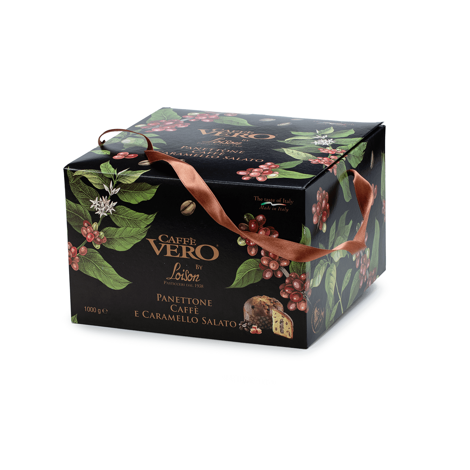
Caffè Vero
This model is created by adapting the dimensions to the product that will be placed inside. It is a box made of rigid cardboard, with graphics that can be designed to unleash imagination and creativity. The boxes will be produced based on the general guidelines provided by the client. The fabric handle will always be matched with the box. Co-branding can also be implemented in this case, as in the two previously presented examples.
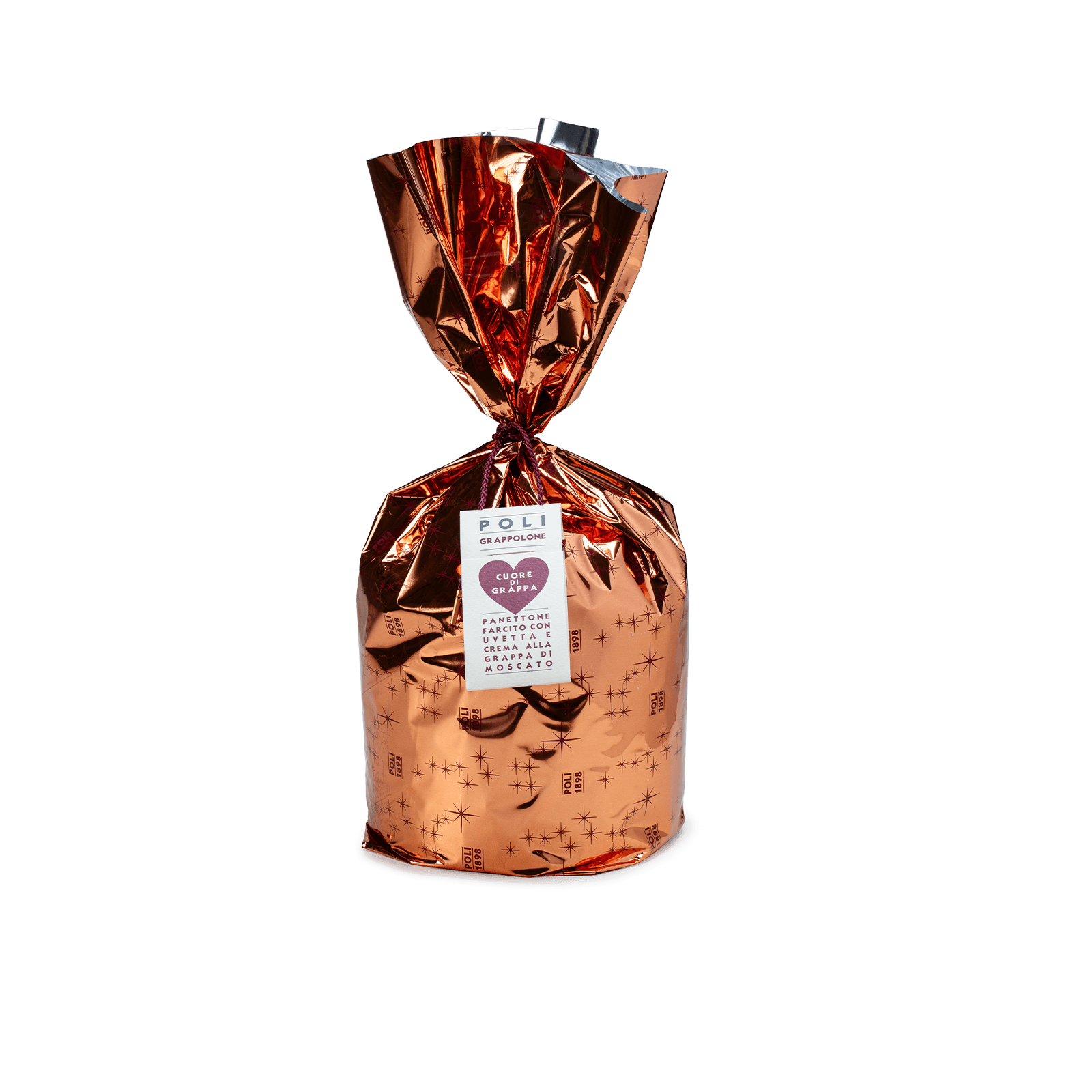
Setup "PACKAGE" Packaging
Poli
For the creation of this packaging, a texture will be designed where the repeated brand logo and illustrations will be printed on a roll and cut to the required size. The ribbon must always be strictly in harmony with the wrapping.
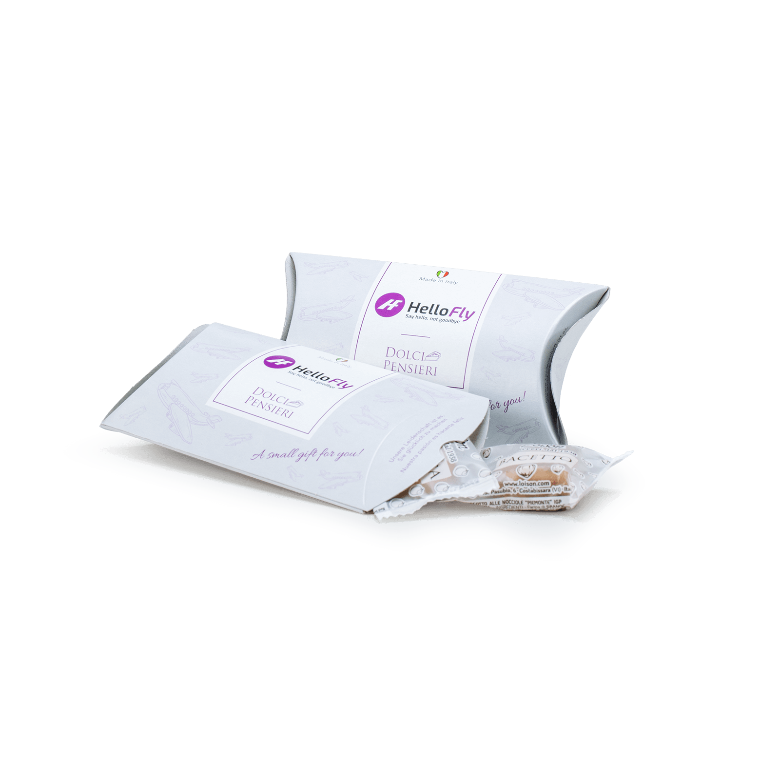
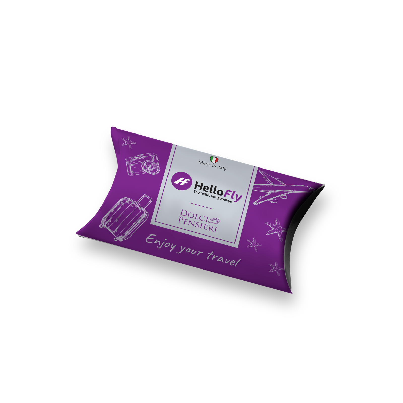
Setup "COOKIE PILLOW"
HelloFly
The custom packaging project aimed to create a solution for welcoming or gifting. Thus, a “cookie pillow” made of rigid cardboard was created, where the client’s logo and operational sector were carefully integrated using their preferred colors. This packaging was designed to offer a treat with 3 butter cookies branded Loison. The same solution can be used as a favor for events, marketing actions, or communications.
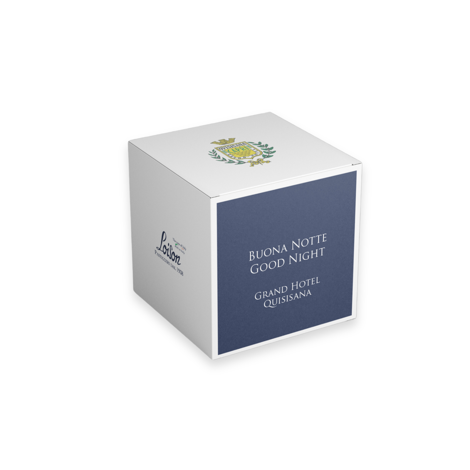
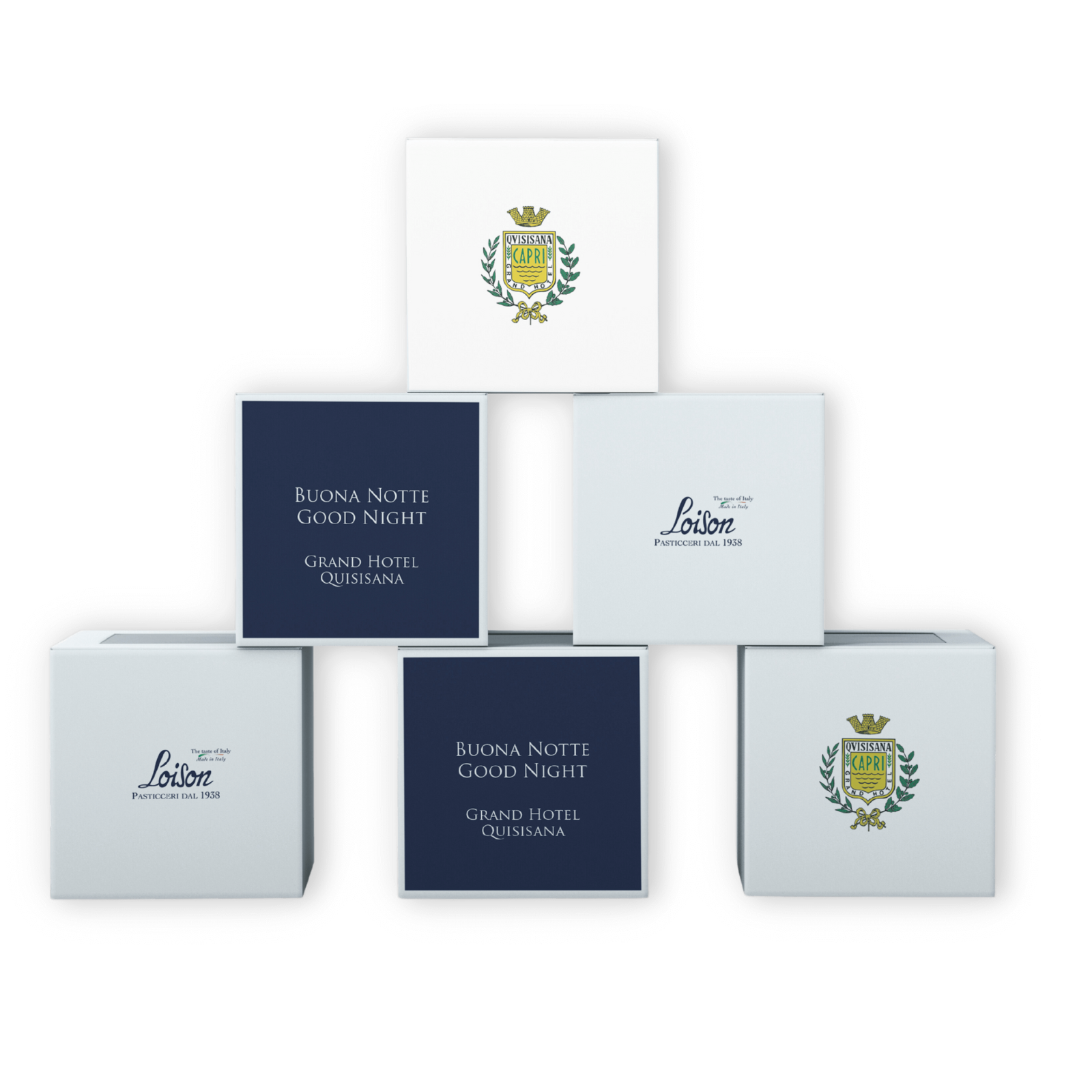
Setup "CASKET"
Grand Hotel Quisisana, Capri
The Grand Hotel Quisisana of Capri commissioned the creation of a Good Night Casket, intended to sublimate the experience of staying at the luxurious hotel with refinement and good taste. The conception of this casket is the result of an accurate and meticulous analysis of the very essence of the Grand Hotel. The casket, with its perfect cubic geometry, bears the hotel’s exquisite logo on the top side, while the sides are adorned with a simple but eloquent greeting, which further enriches the experience of staying at the Grand Hotel Quisisana. This treasure chest can be defined as multi-sensory, thanks to the exquisite summer offering of artisanal biscuits, skilfully made by the renowned Dolciaria Loison, stored inside.
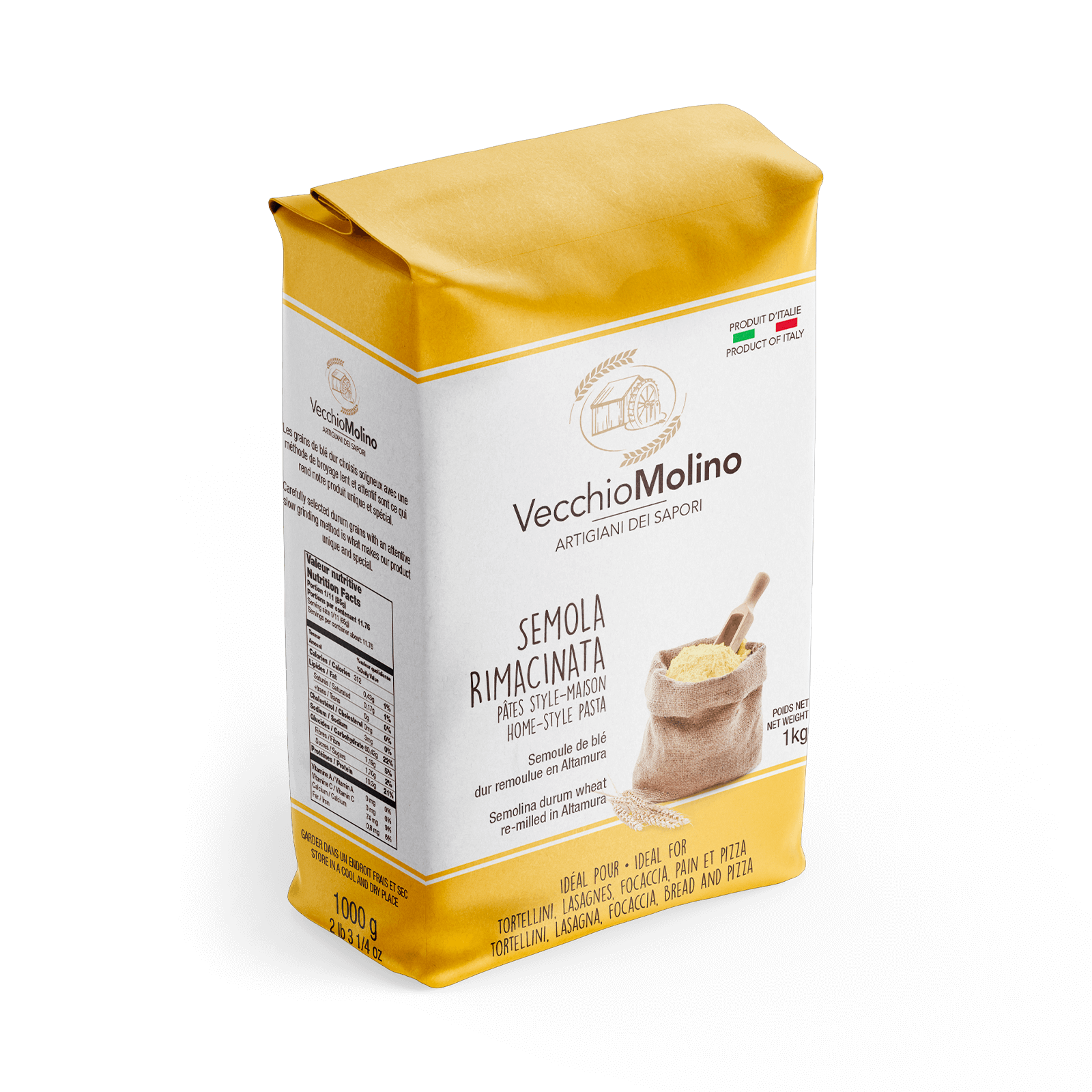
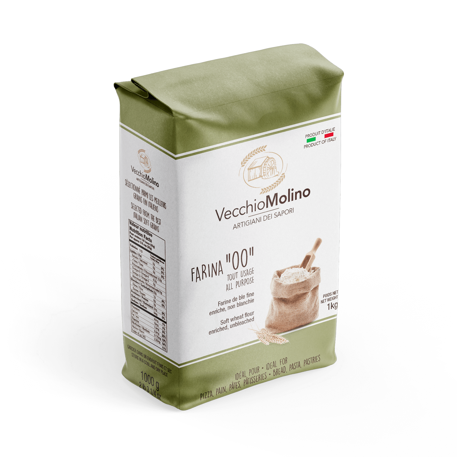
Setup “CAFFÈ”
IRIS Importing and Distributing
The new packaging for Vecchio Molino flour has been designed with simple, readable characters that combine modernity and tradition to make the information clear and appealing. The packaging is characterised by simplicity, clarity and versatility.
The packaging design uses muted colours and a clear layout. The graphics allow the consumer to instantly identify the product and its main characteristics. Essential information such as the type of flour, its origins and how to use it is clearly presented for effective and immediate communication.
The packaging has been designed to easily adapt to the company’s different product lines, maintaining a visual consistency that makes each variant instantly recognisable as part of the same family.
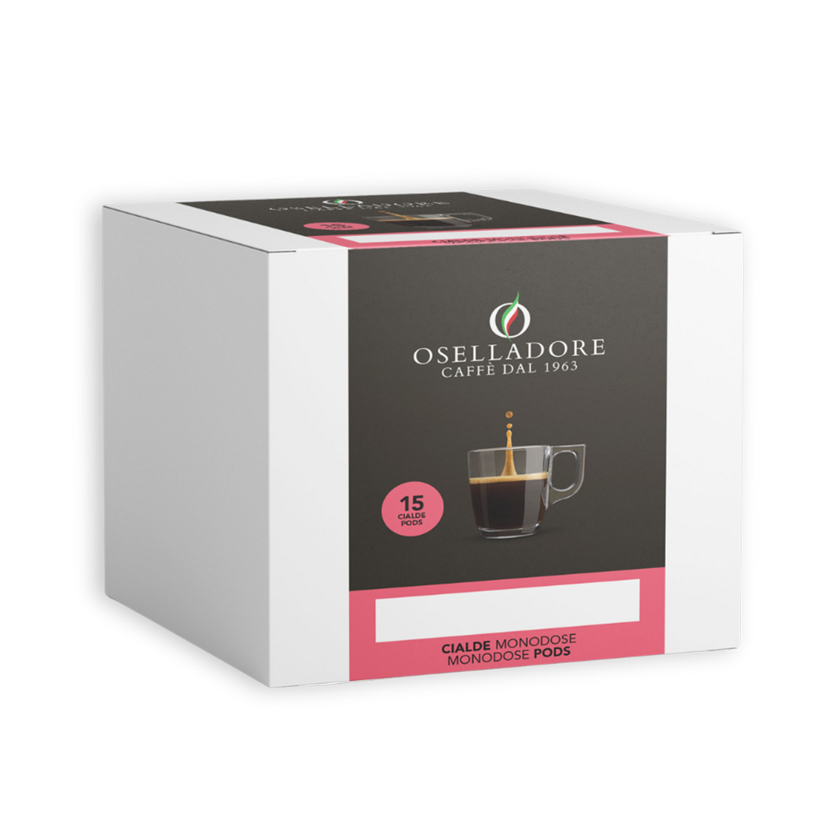
Setup “CAFFÈ”
Oselladore
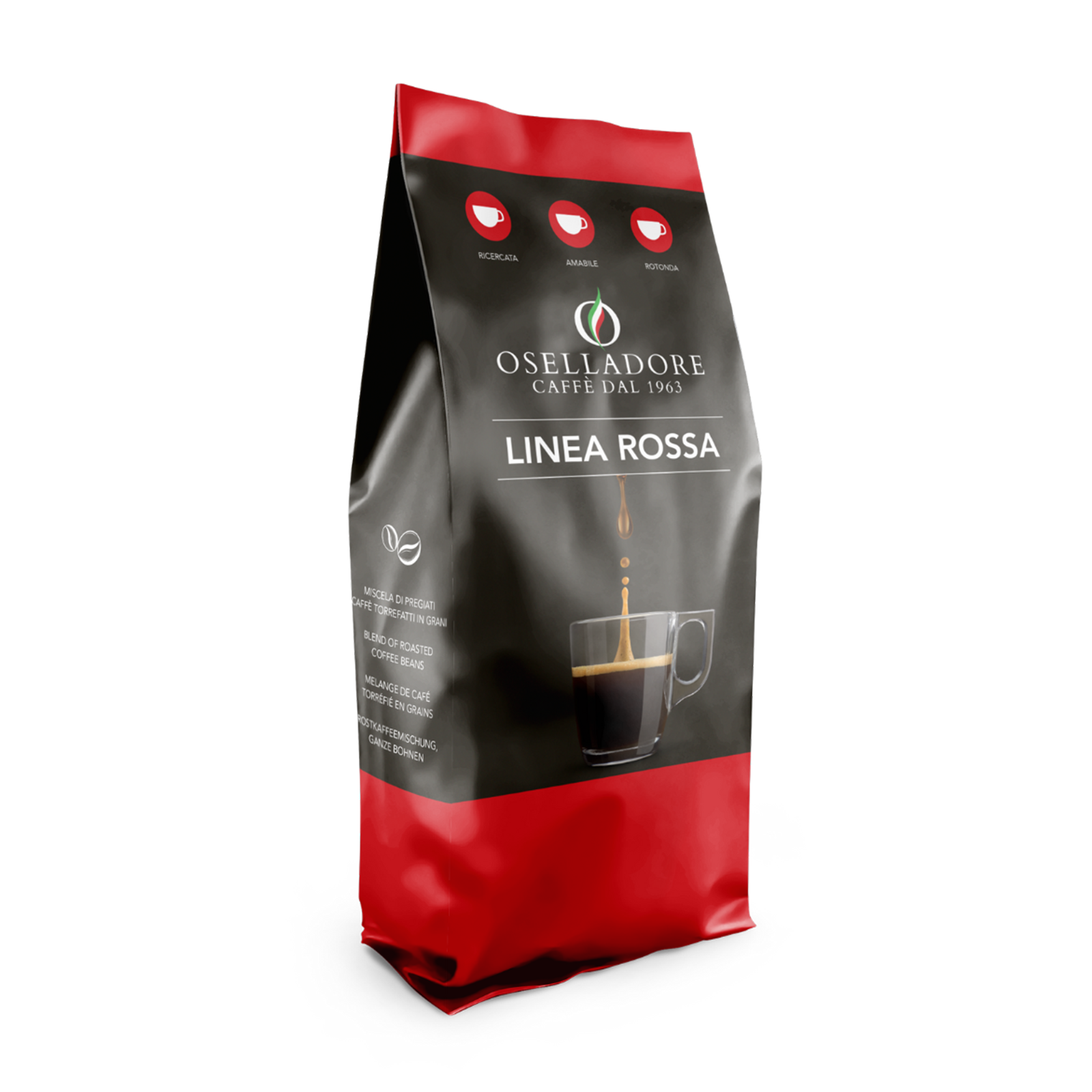
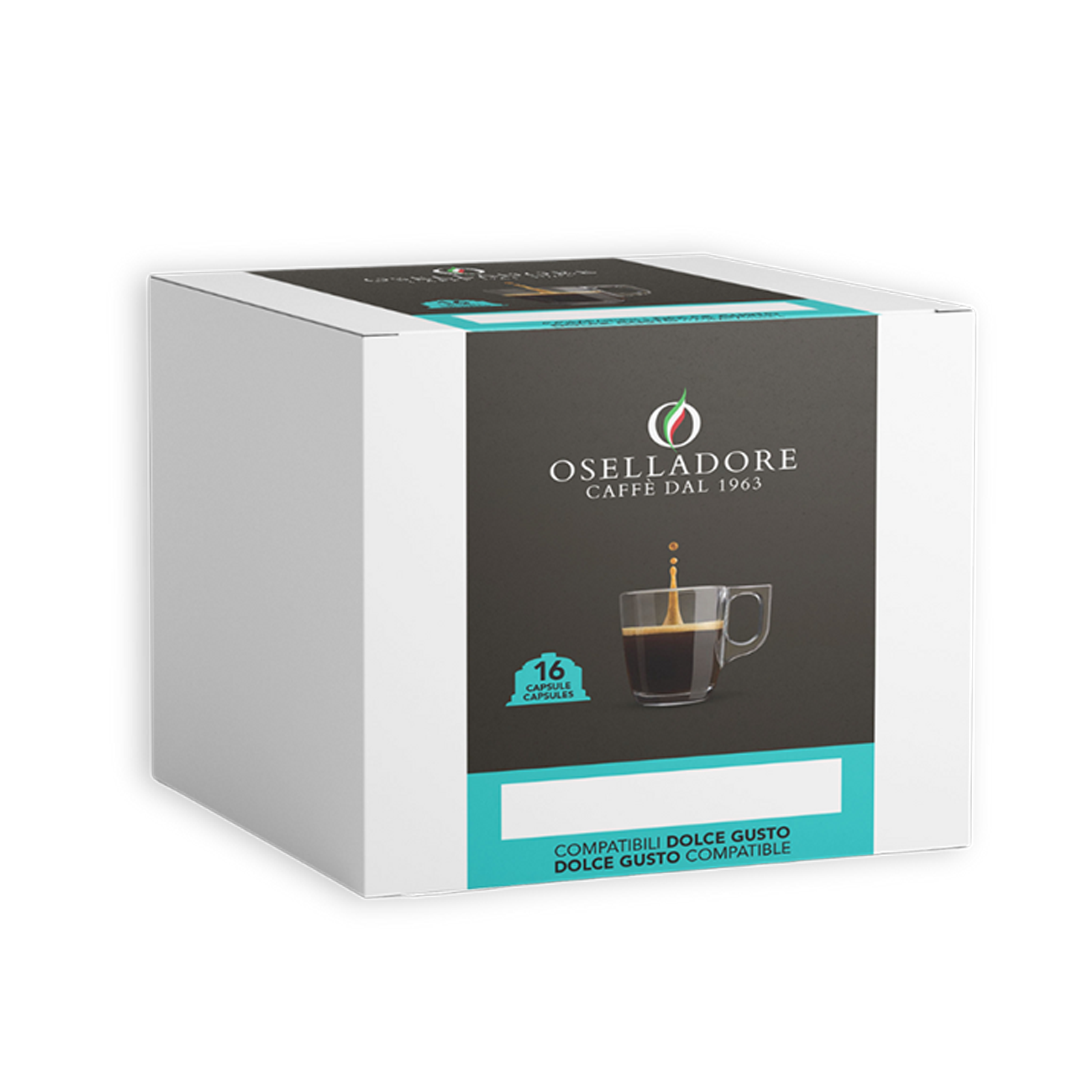
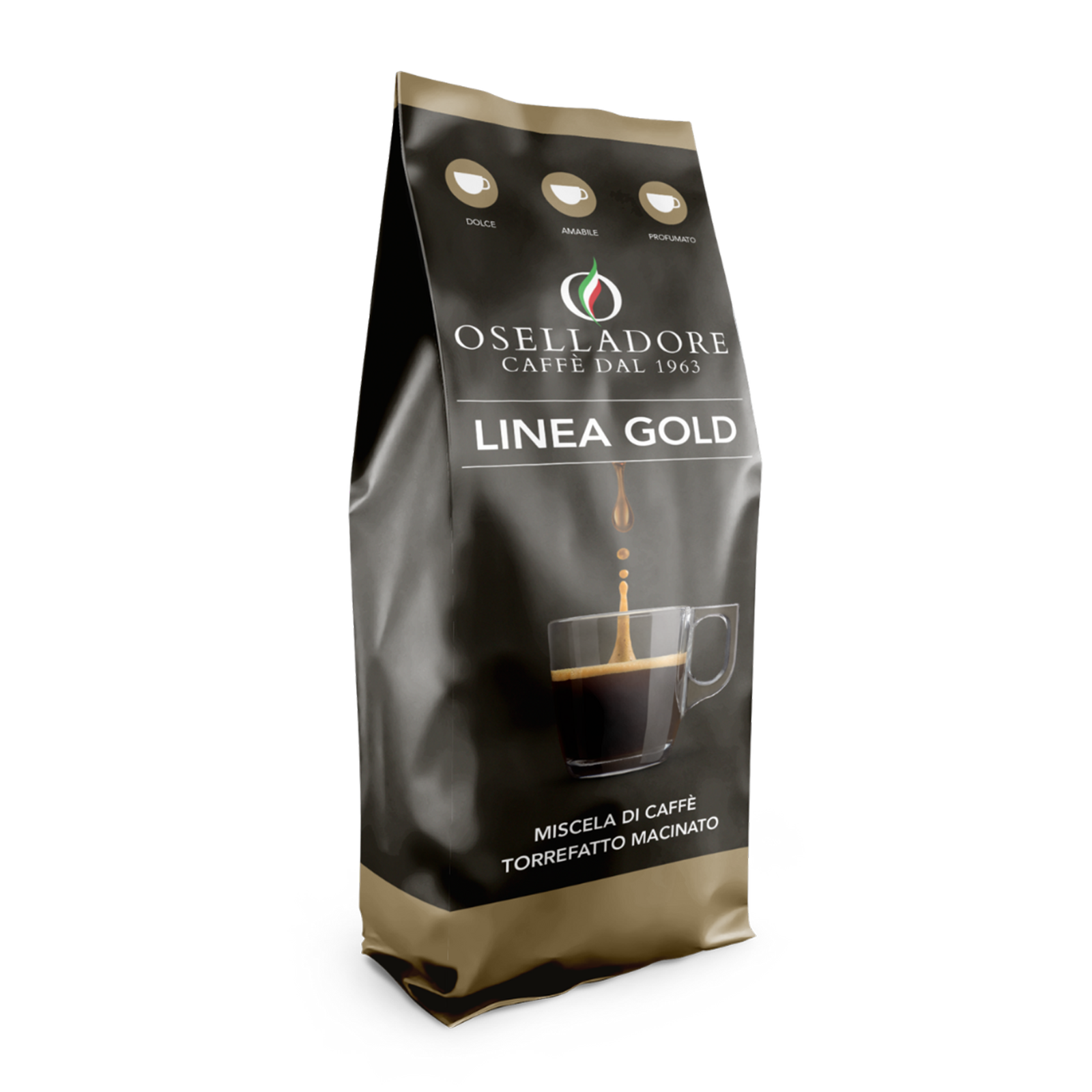
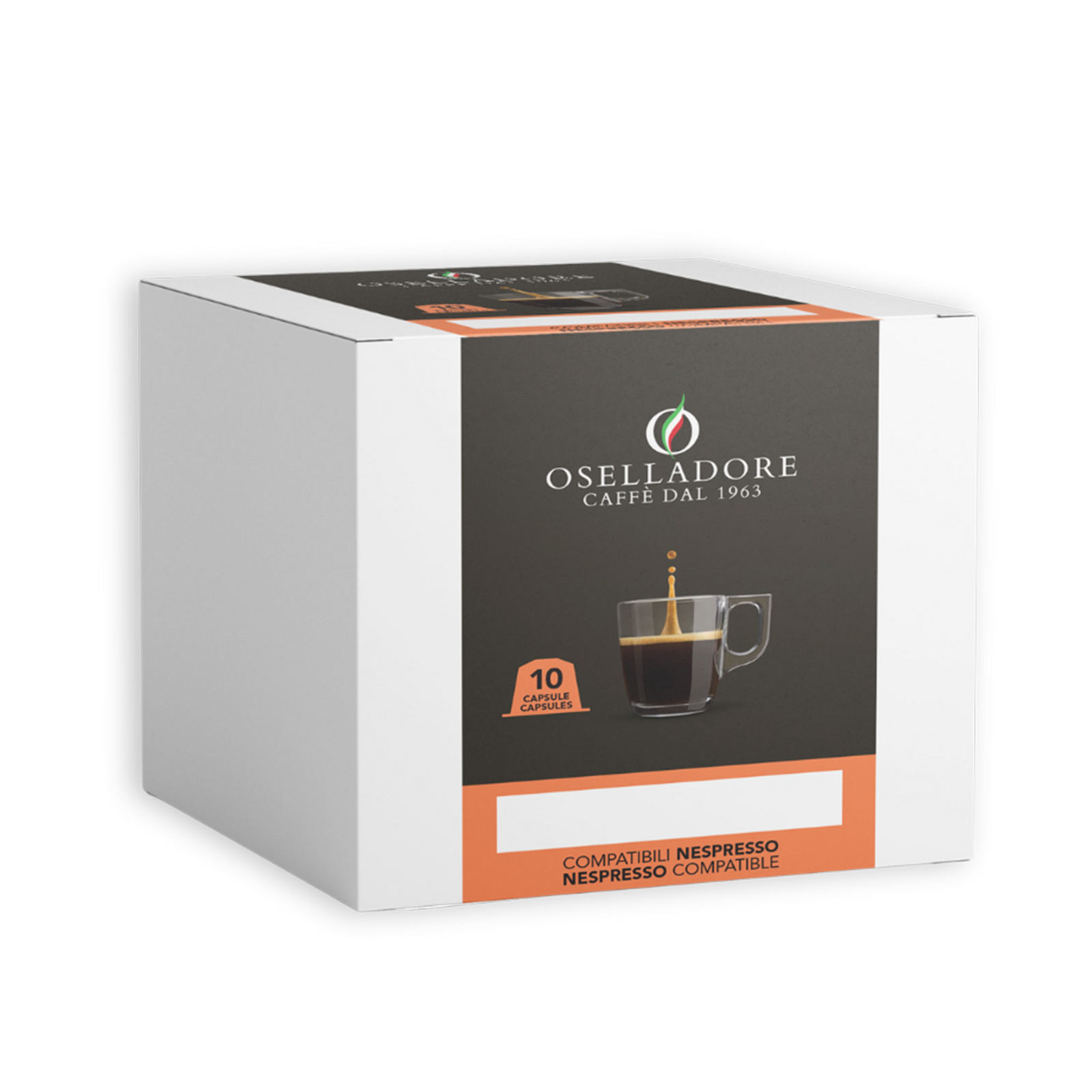
The packages designed for Oselladore represent a real journey into the essence of Italian coffee, designed to enhance the premium character and high quality of the product. These packages do not just contain, but visually and sensorially communicate the authenticity of the blends, elegantly recalling the Italian character and art of coffee.
The packaging design is studied to visually differentiate the different product lines, telling through graphic and visual elements the distinctive characteristics of each blend and capsule. Each product line is identified by a specific colour code and icons representing the characteristics of creaminess, intensity and taste. Different formats, for different consumption needs.
Setup “CASKET”
Venice Casino
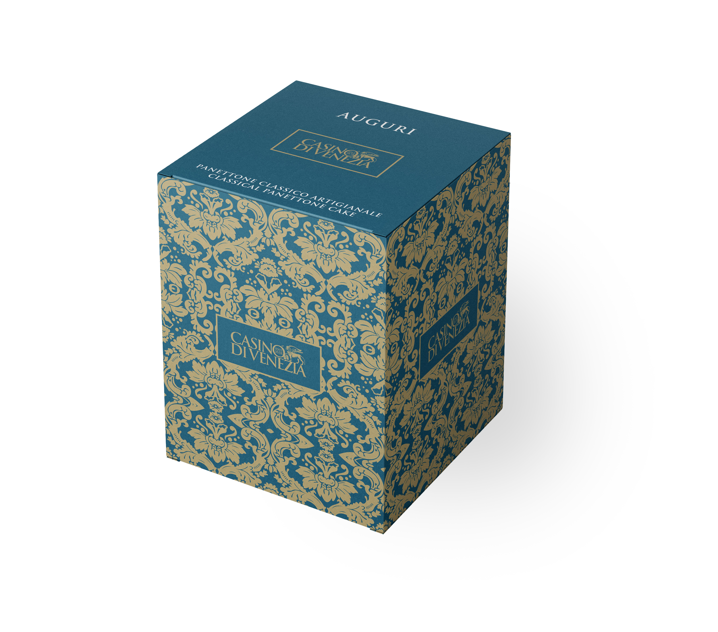
The Venice Casino, in its noble gesture of homage to its guests, has chosen to rely on Sonia Design. This golden casket blends taste and tradition with the elegance of design, preserving the craftsmanship of Loison’s classic panettone. A cube decorated with refined artistic motifs in gold, the emblem of the Casino, manages to convey an aura of historicity and magnificence. The iconic logo with the lion of Venice has been skilfully integrated into the design, creating a harmonious effect. When opening the cube, the greeting dedicated to each guest appears clearly and legibly, further enriching the experience of this exclusive gift.
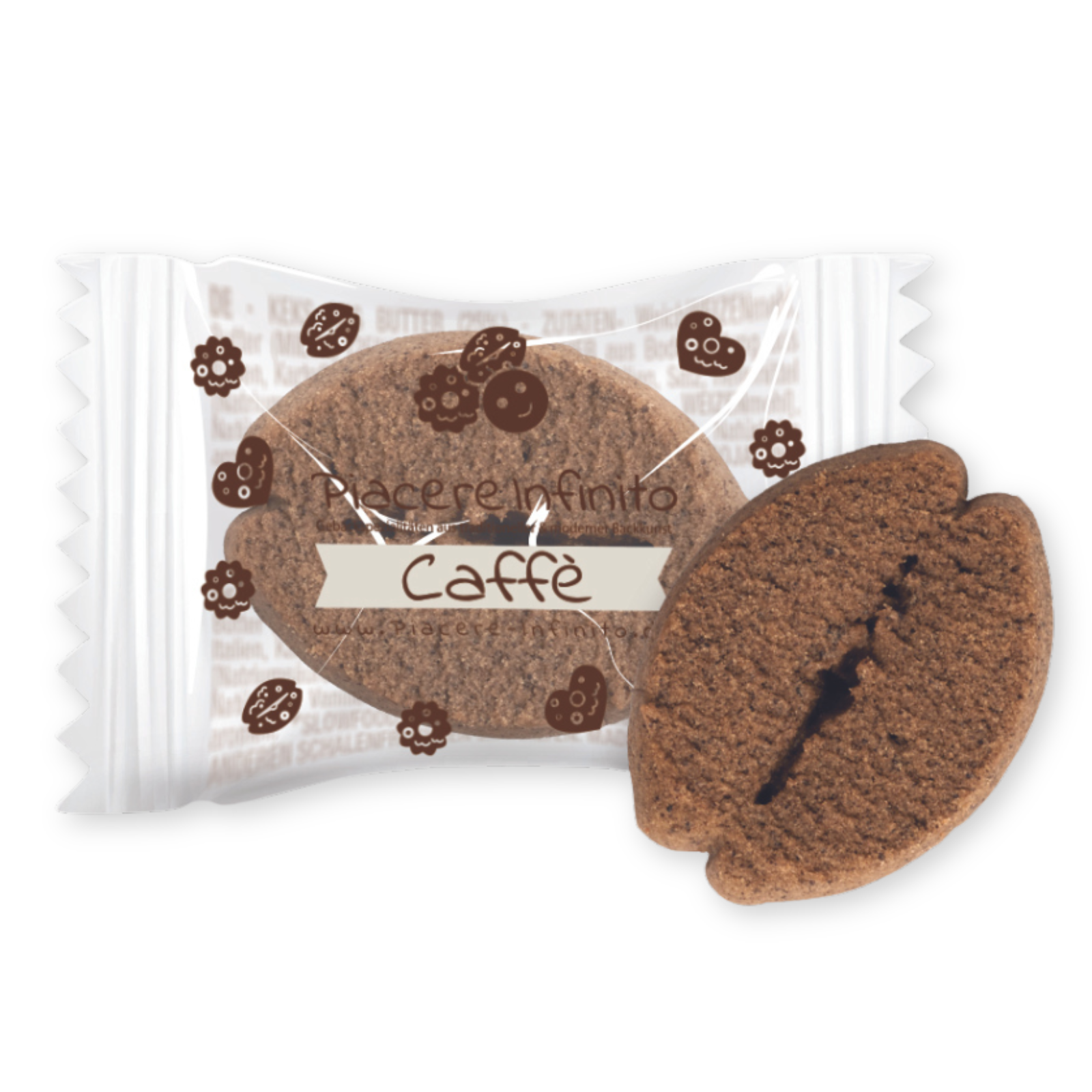
Setup “FILM BISCUITS”
Piacere Infinito
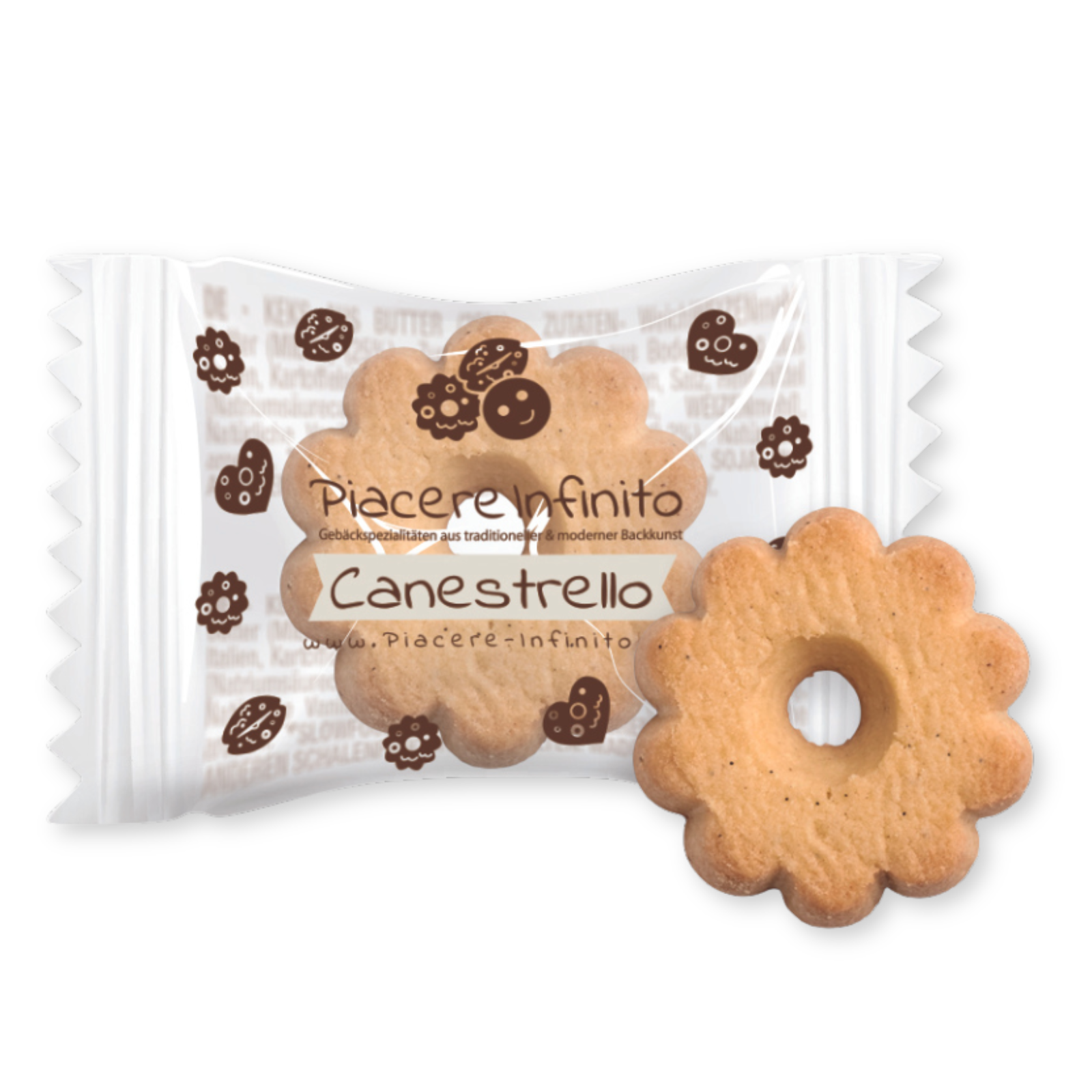
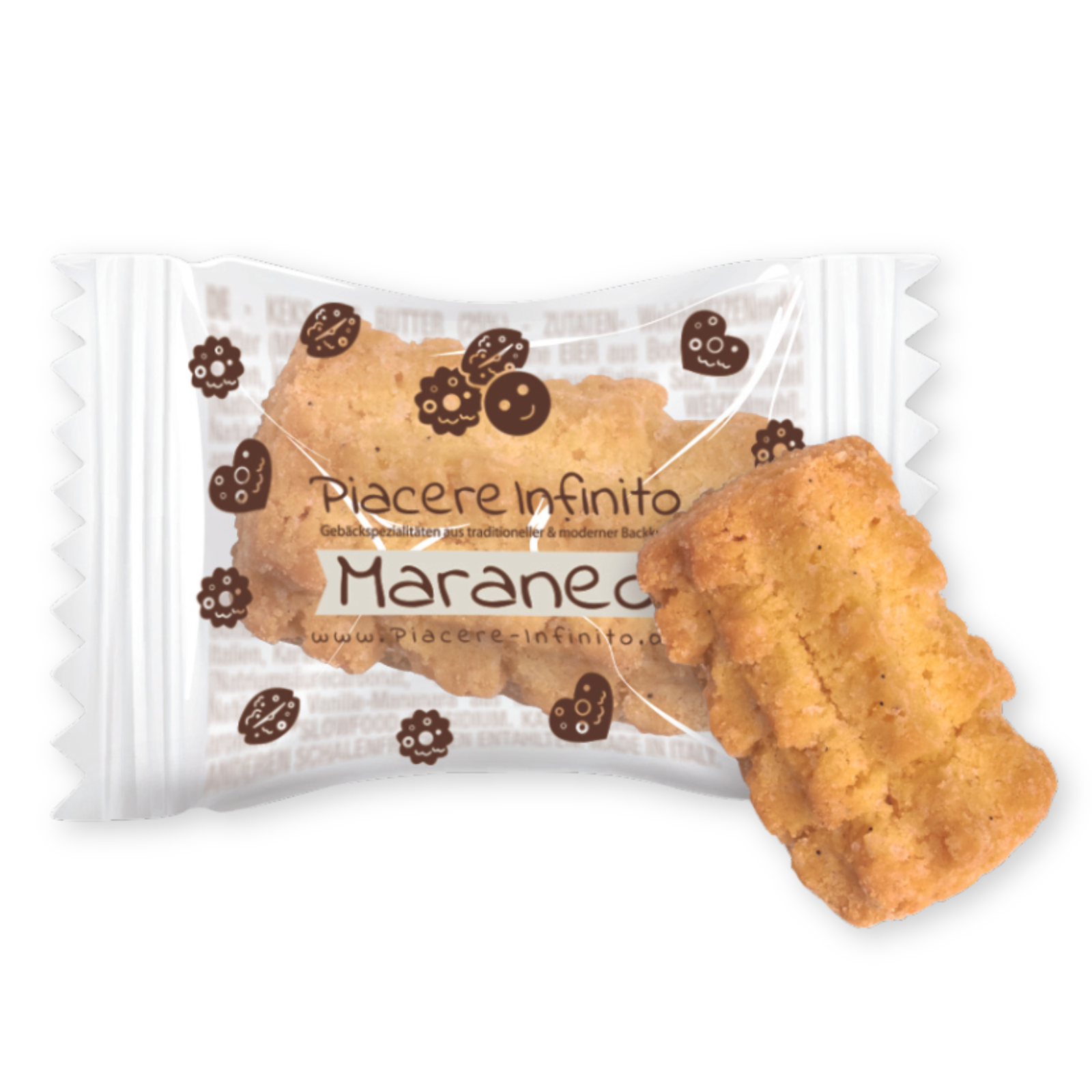
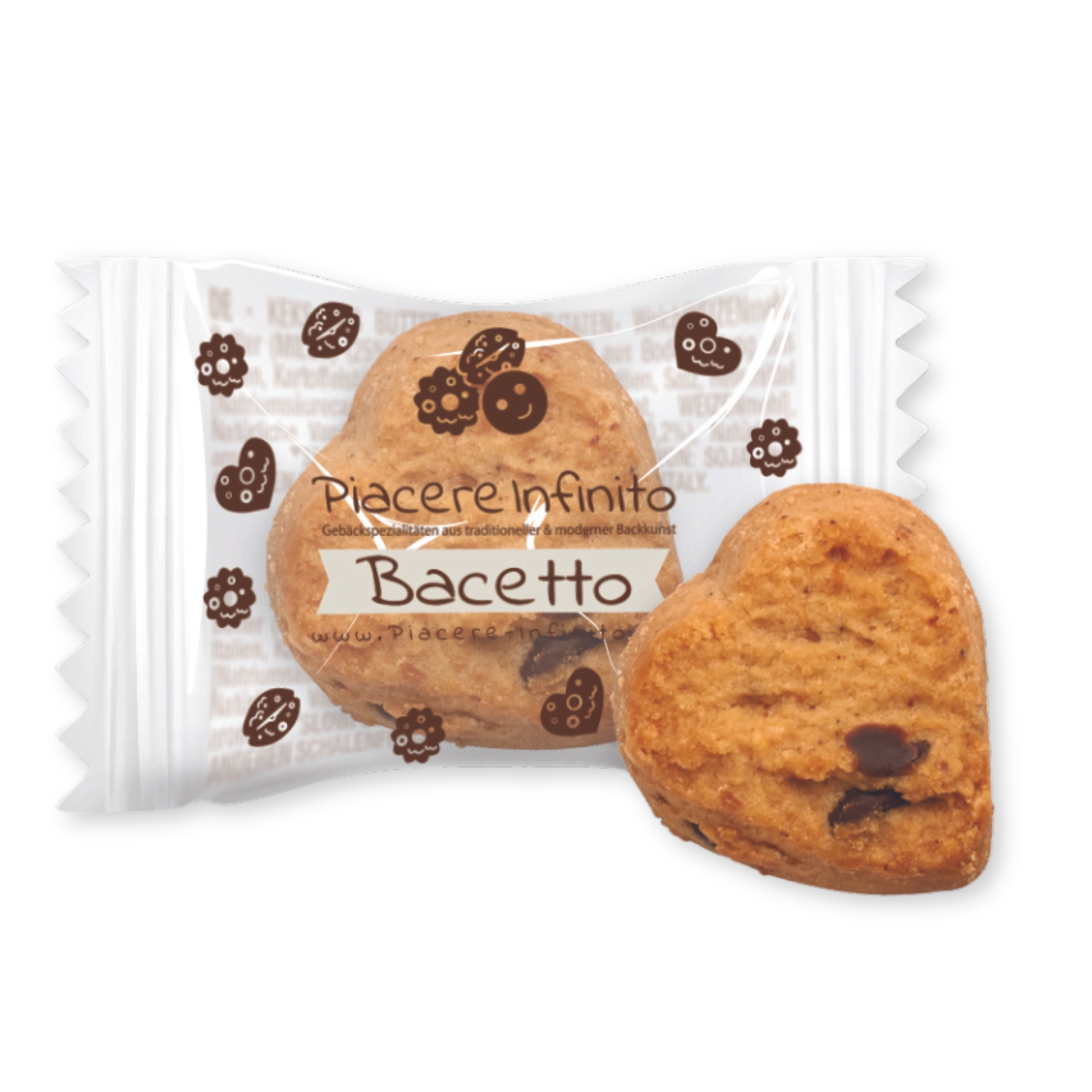
Sonia Design realised the customisation of the biscuit film for Piacere Infinito, a company dedicated to the art of offering its customers the best culinary products, the result of a meticulous selection of the manufacturing realities and raw materials that embody the excellence of the territories. With elegance and clarity, the design narrates the product, revealing its substance with transparency and originality.
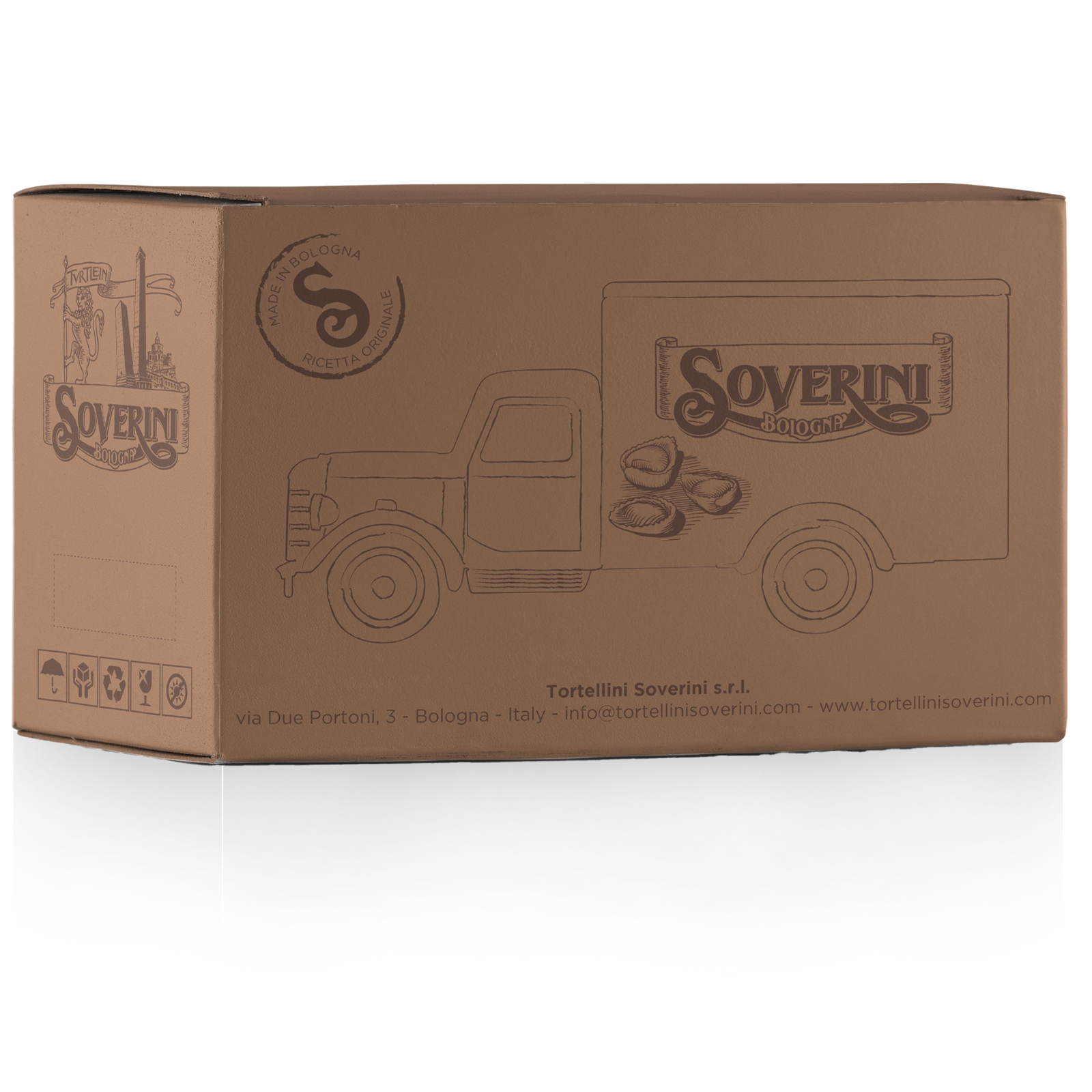
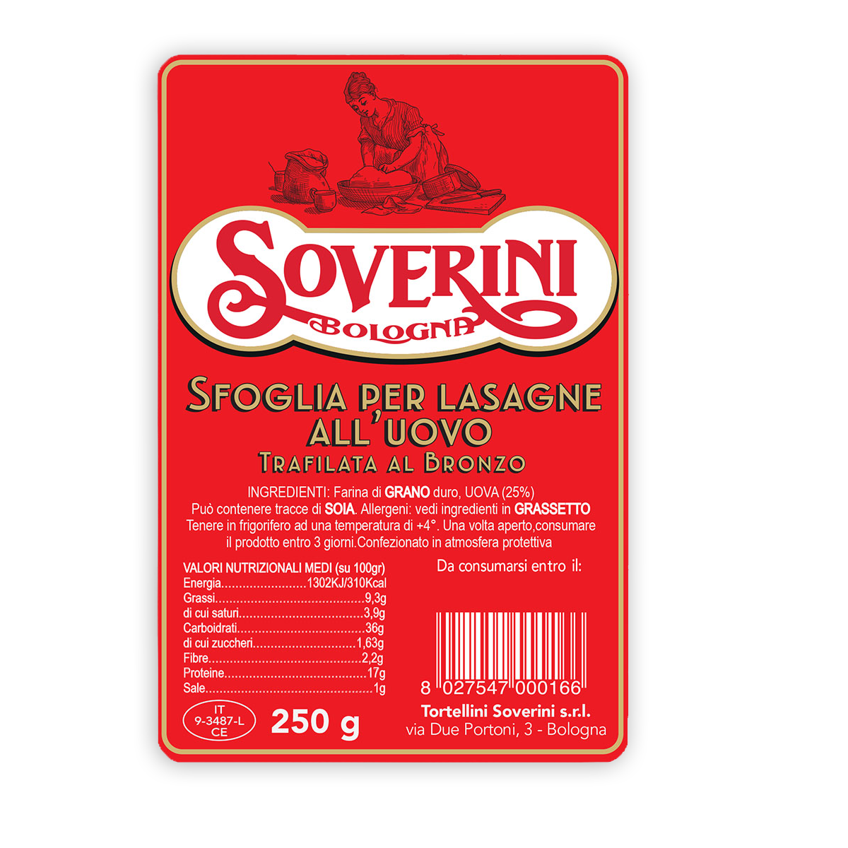
Setup “PASTA”
Tortellini Soverini
Each element was created with a decorative and elegant style, using red, the brand’s distinctive colour, and enriching it with precious golden details. The essence of the Tortellini Soverini brand and its meticulous attention to image are reflected in the packaging: simple, clear and immediate, but at the same time rich in brand identity. The packaging, far from being mere containers, is a concrete expression of the values that both companies share: craftsmanship, refinement and sustainability.